AT&T REFRESH
Redefining a legacy brand
Redefining a legacy brand
A pioneer in its field, AT&T has always been about paving the way for innovation—providing its customers with products, services, and value that helps them live a more meaningful and connected life. With so much competition between telecom and entertainment companies, we were in need of repositioning ourselves within the market, while looking for better ways to provide a more premium, seamless, and personalized customer experience.
Being the strong voice behind digital, our team helped to lead the effort in bringing AT&T an evolved brand identity, integrated design system, improved UX framework, and overall quality point-of-view in all things customer related.
Brand refresh
Brand refresh
Viewed as an older and traditional brand, we sought to redefine who we are, and reposition ourselves within the market as unique, youthful, energetic, and vibrant. Working closely with partner teams, we looked to the core elements of a brand: color, typography, and photography, to evolve our overall look & feel and find new and fresh ways to express ourselves and the value we bring to our customers.
Viewed as an older and traditional brand, we sought to redefine who we are, and reposition ourselves within the market as unique, youthful, energetic, and vibrant. Working closely with partner teams, we looked to the core elements of a brand: color, typography, and photography, to evolve our overall look and feel and find new and fresh ways to express ourselves and the value we bring to our customers.
Viewed as an older and traditional brand, we sought to redefine who we are, and reposition ourselves within the market as unique, youthful, energetic, and vibrant. Working closely with partner teams, we looked to the core elements of a brand: color, typography, and photography, to evolve our overall look & feel and find new and fresh ways to express ourselves and the value we bring to our customers.
Color
Led by the core color: AT&T Blue, our Brand team proposed that we explore a supporting color palette that can help add more life and energy to the brand. Our team helped define the overall color theory and strategy; exploring just the right color pairings, hues, and gradients.
Led by the core color: AT&T Blue, our Brand team proposed that we explore a supporting color palette that can help add more life and energy to the brand. Our team helped define the overall color theory and strategy; exploring just the right color pairings, hues, and gradients.


Typography
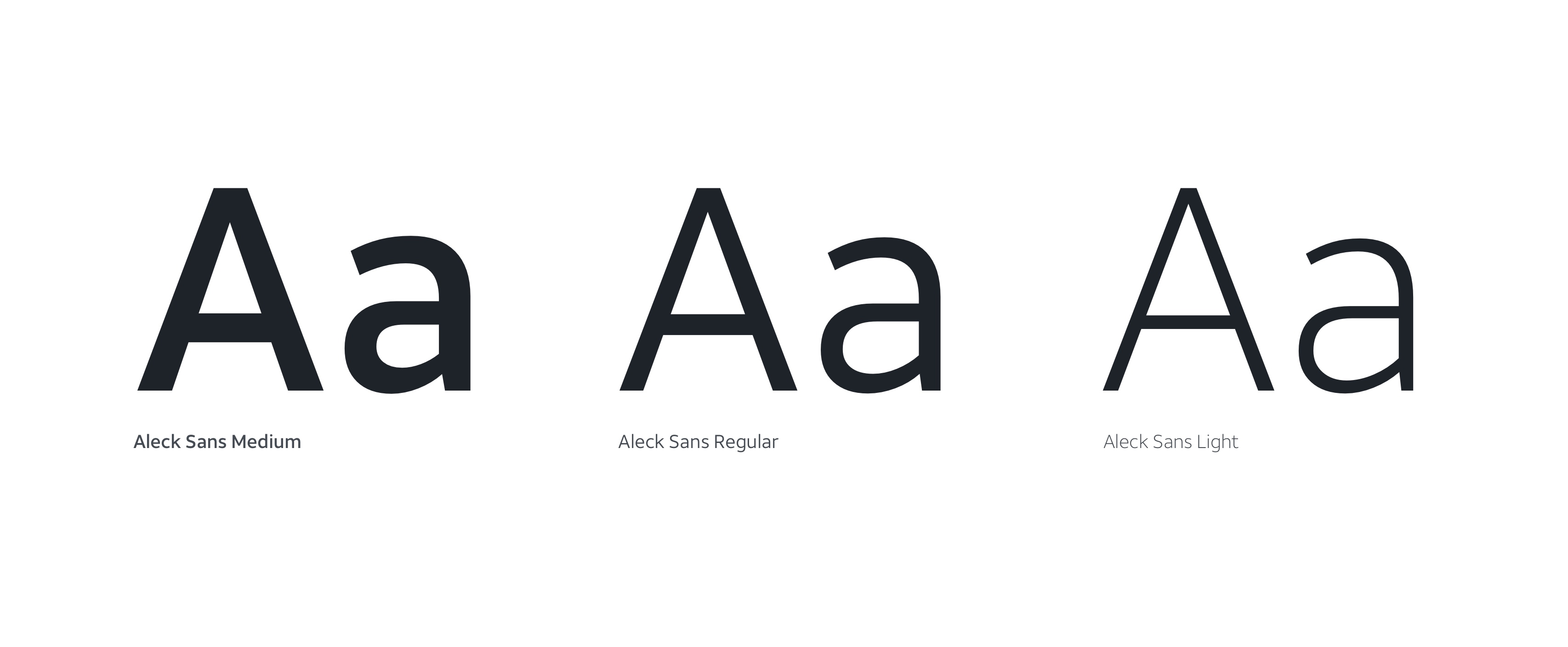
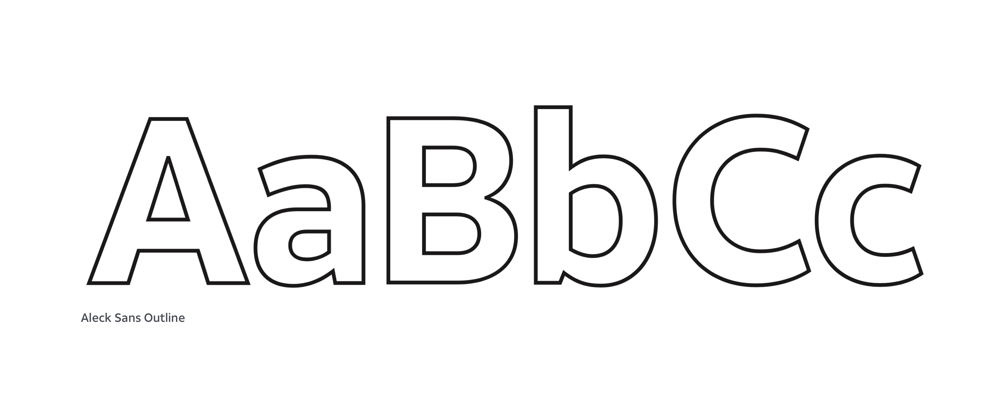
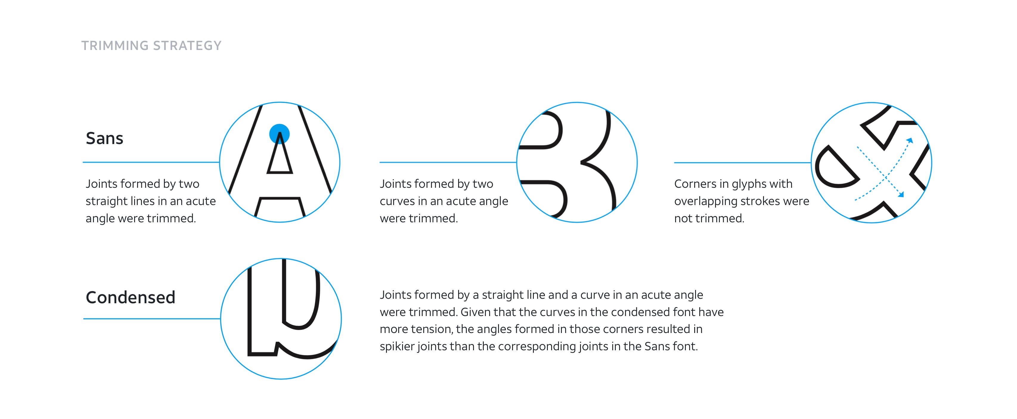
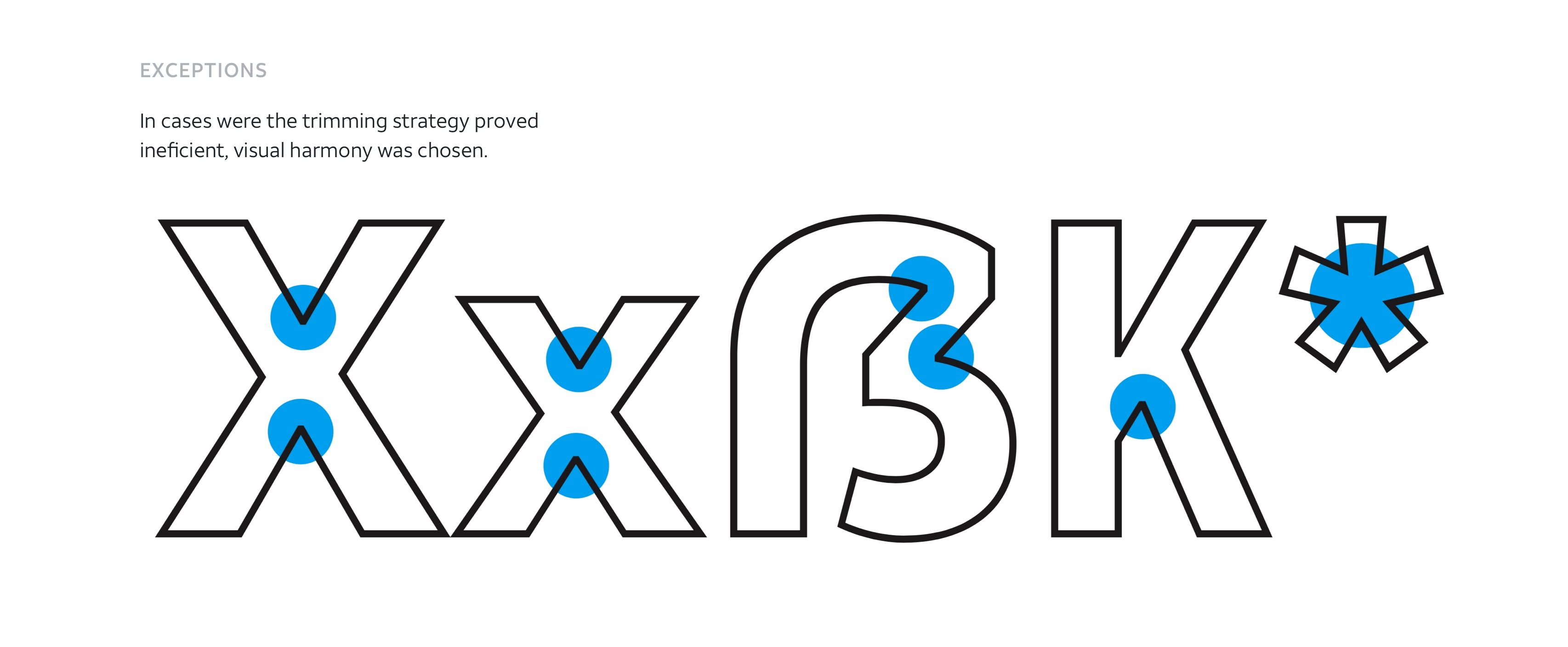
Sticking with our custom typeface: AT&T Aleck Sans, we examined fonts and pairings that would bring consistency to the brand, while offering more flexibility and practicality for the different platforms. We also proposed the creation of a new outlined version of Aleck Sans, that was done in partnership with the brand team and type foundry Dalton Maag.
Sticking with our custom typeface: AT&T Aleck Sans, we examined fonts and pairings that would bring consistency to the brand, while offering more flexibility and practicality for the different platforms. We also proposed the creation of a new outlined version of Aleck Sans, that was done in partnership with the brand team and type foundry Dalton Maag.
Style Exploration
We explored ways to represent the brand in bold and colorful fashion across our entire ecosystem—taking into consideration print, broadcast, and digital. Style boards and a range of contextual placements explored how color, type, photography, illustration, and composition all come together to create a fresh and revived look and feel.
We explored ways to represent the brand in more bold and colorful fashion across our entire ecosystem—taking into consideration print, broadcast, and digital. Style boards and a range of contextual placements explored how color, type, photography, illustration, and composition all come together to create a fresh and revived look and feel.
We explored ways to represent the brand in bold and colorful fashion across our entire ecosystem—taking into consideration print, broadcast, and digital. Style boards and a range of contextual placements explored how color, type, photography, illustration, and composition all come together to create a fresh and revived look and feel.


Consumer Feedback
We conducted online surveys to test and validate our design direction, with the goal of evaluating the overall appeal of and emotional response to the current/BAU brand expression as compared to our new brand expression. The survey included 549 respondents, ages 18-55+, that were both AT&T and non-AT&T customers. We hit the mark on all of our intended goals—with the majority of respondents feeling the work was more youthful, energetic, and vibrant.
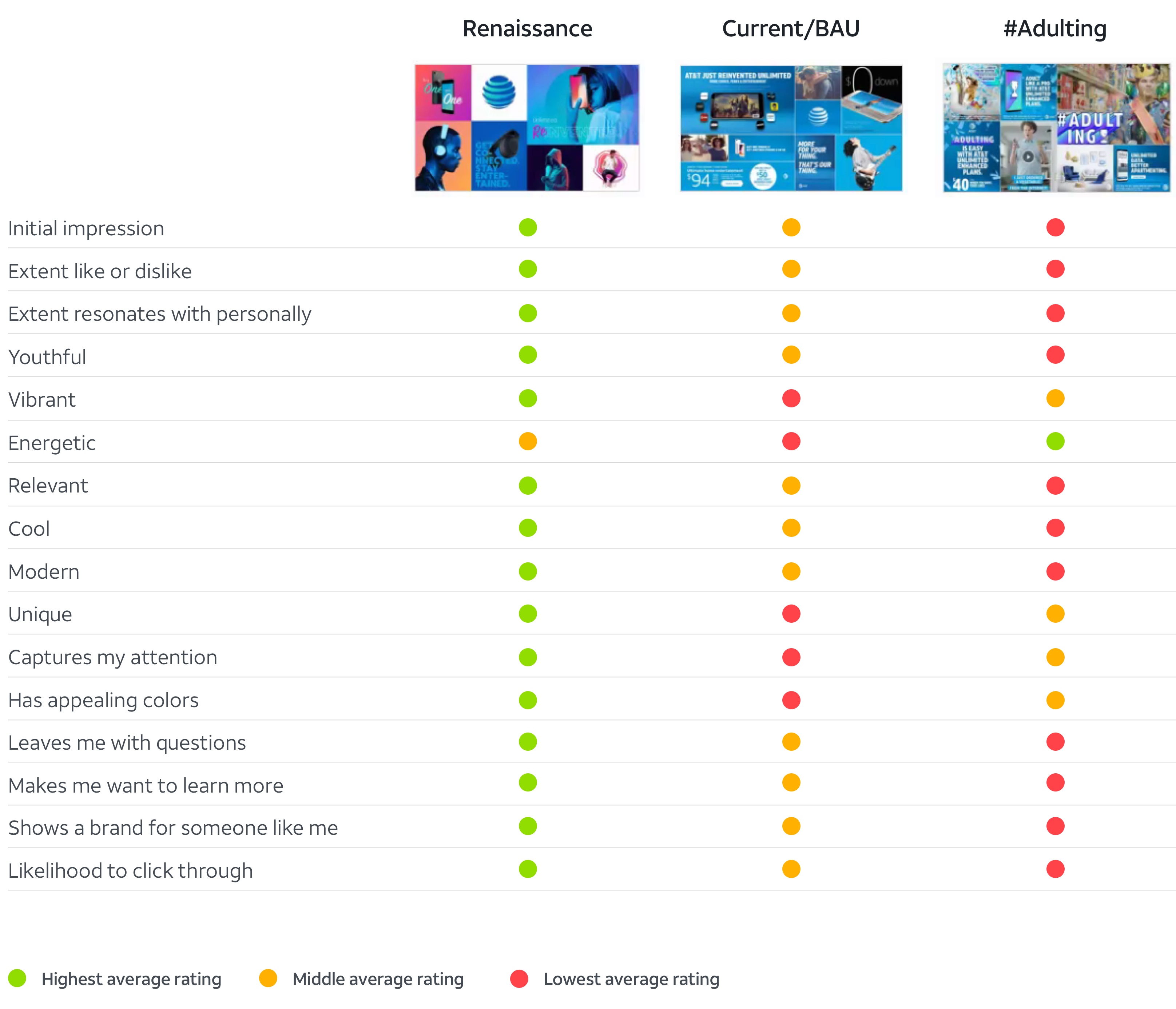
"I want to just keep looking at it. The colors, the people, the faces...are drawing me in. I didn't know AT&T had headphones. I LOVE THIS. It feels fresh, modern and interesting — not typical or expected."
Testing participant
Female, 24 years old
Photoshoot
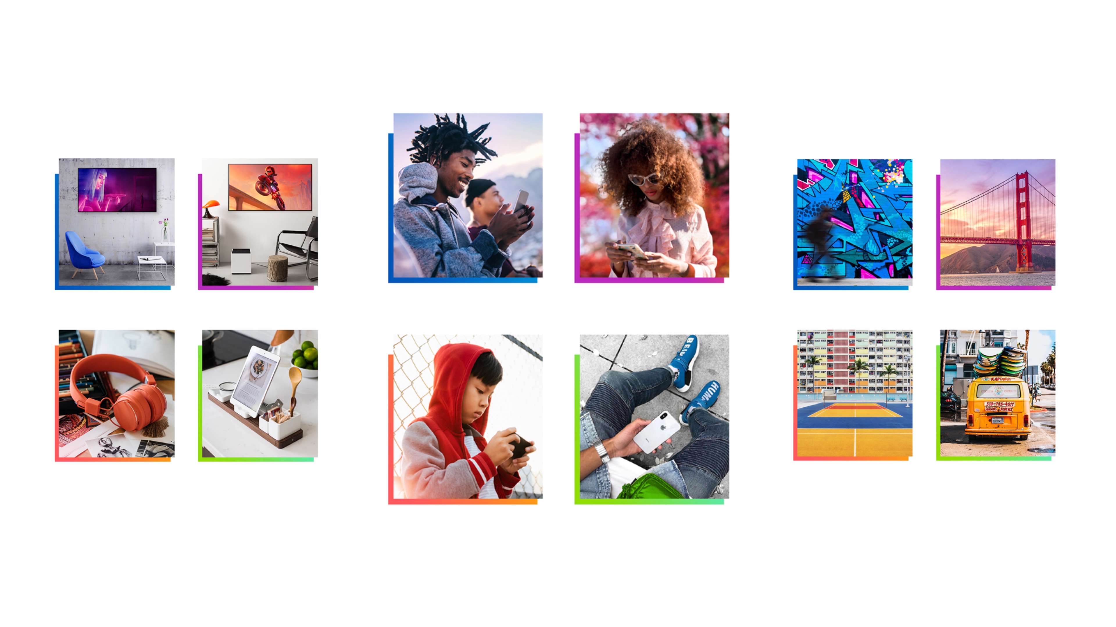
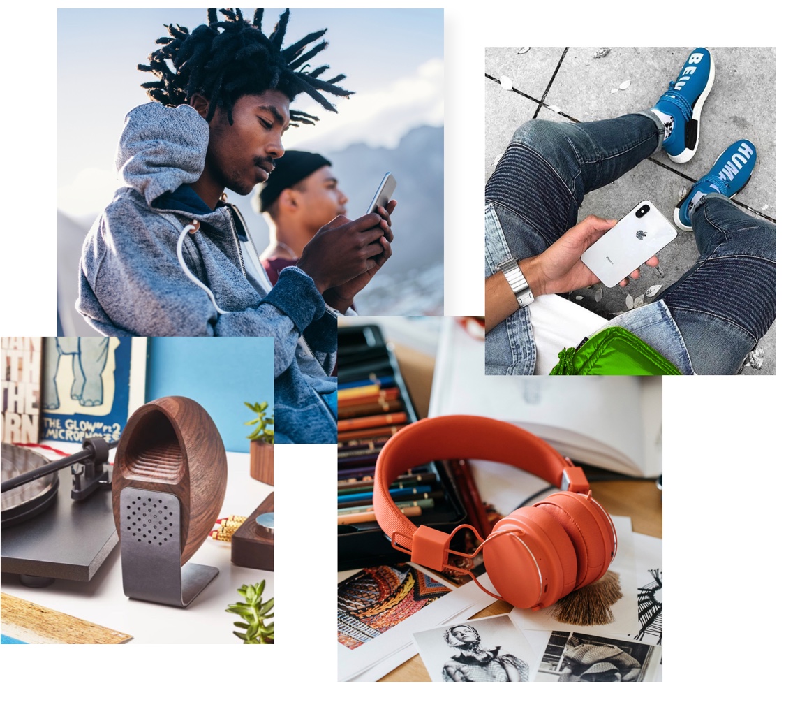
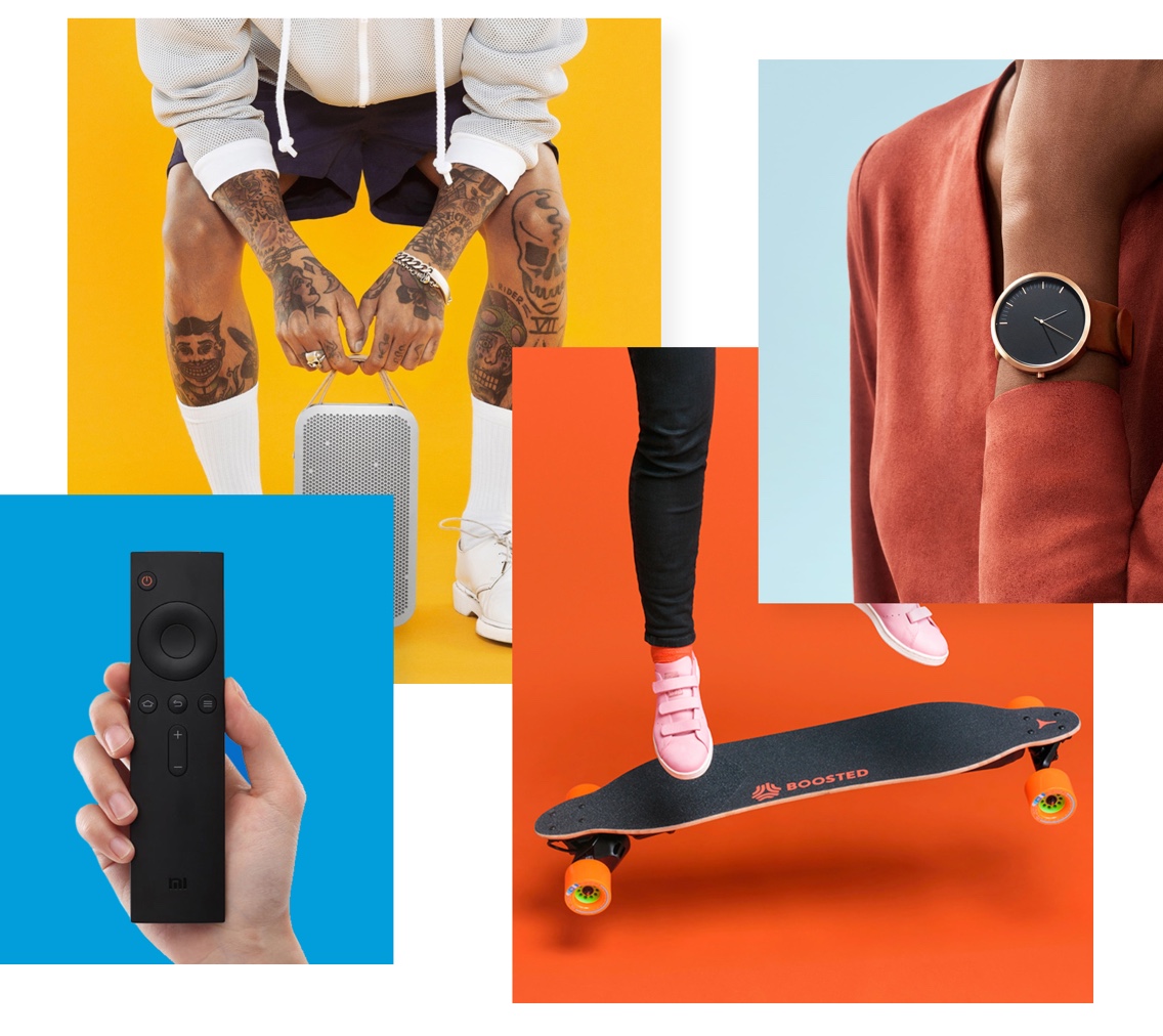
Our photography aims to inspire our audience and provide a relevant representation of the value we bring to our customers’ lives. We desperately needed to move away from cheesy stock imagery that wasn't consistent, unique, or compelling. The team conceptualized, strategized, and produced a library of custom imagery to help set the path for the new AT&T.
Our photography aims to inspire our audience and provide a relevant representation of the value we bring to our customers’ lives. We desperately needed to move away from cheesy stock imagery that wasn't consistent, unique, or compelling. The team conceptualized, strategized, and produced a library of custom imagery to help set the path for the new AT&T.
Personas
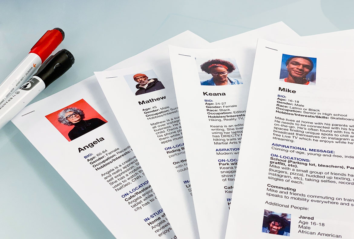
Personas were developed to tell stories of our products and services through the lens of people. They considered a diverse range of ethnicities and age groups—and even a few pet dogs. Everything from the locations, wardrobe, scenes, and shot list were developed with these personas in mind ensuring a consistent execution that felt real and relatable.
Look & Feel
Moodboard for lifestyle imagery
Moodboard for studio imagery
Moodboard for studio imagery
Episodic Event Calendar
Working with our Strategy team, we partnered to develop an episodic calendar of events that would ensure fresh and relevant content across att.com. We developed stories and a comprehensive shot list to capture the business needs through the lens of major events like Mothers Day, Back to School, Dads & Grads, and more.

Final Images


Digital design system
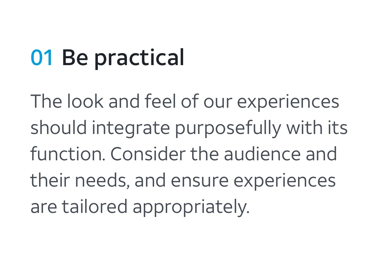
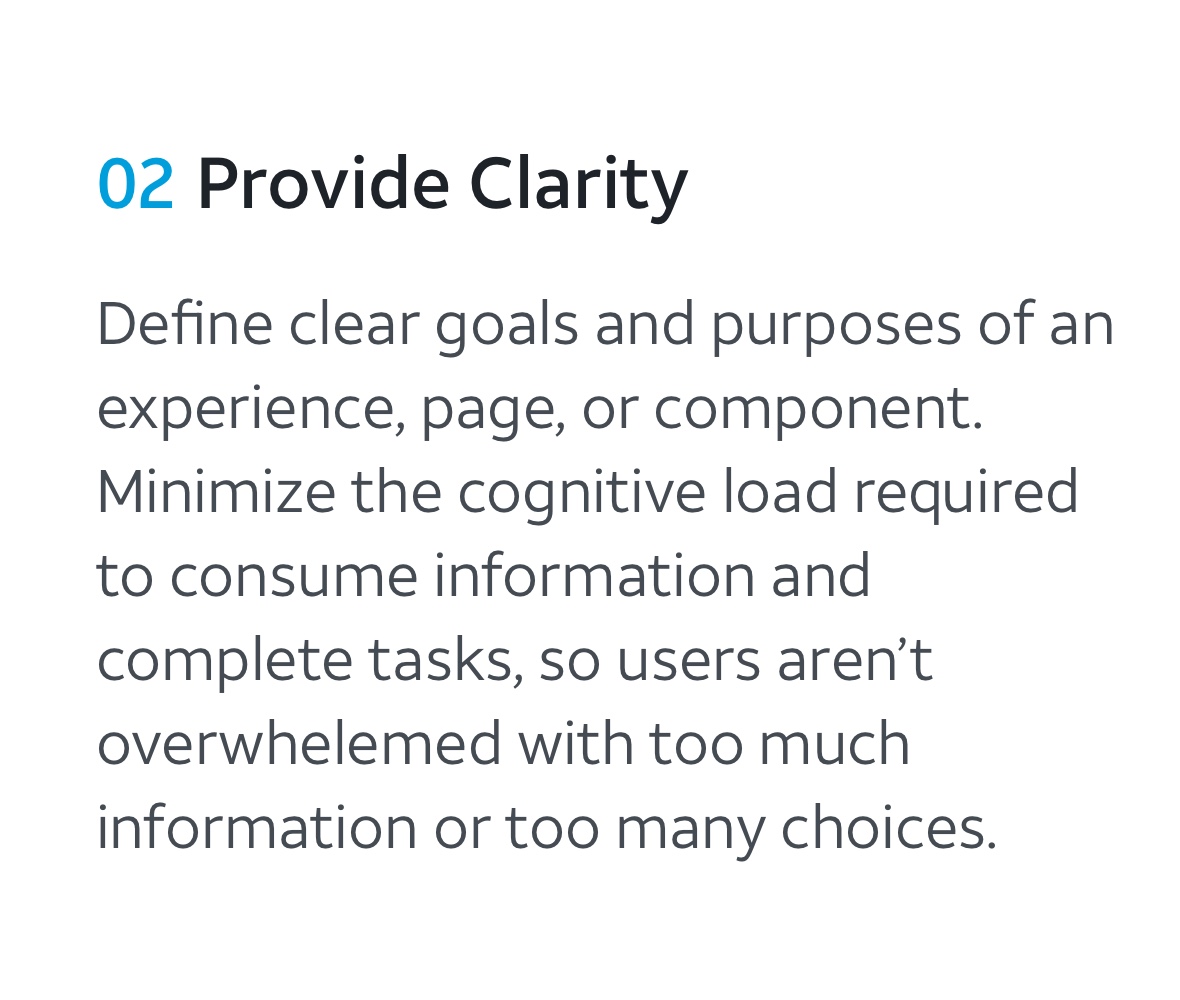
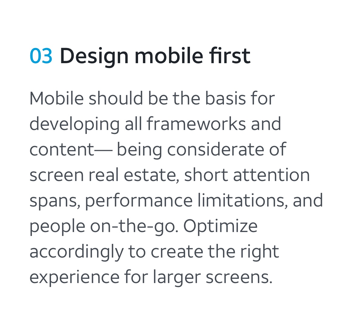
We created the foundation for a new digital design system to unite all of AT&T's products and experiences with a common visual language. It was designed to be highly scalable across platforms, and serves as the basis and inspiration for multiple ongoing efforts.
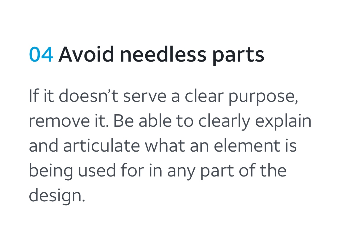
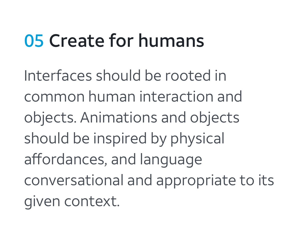
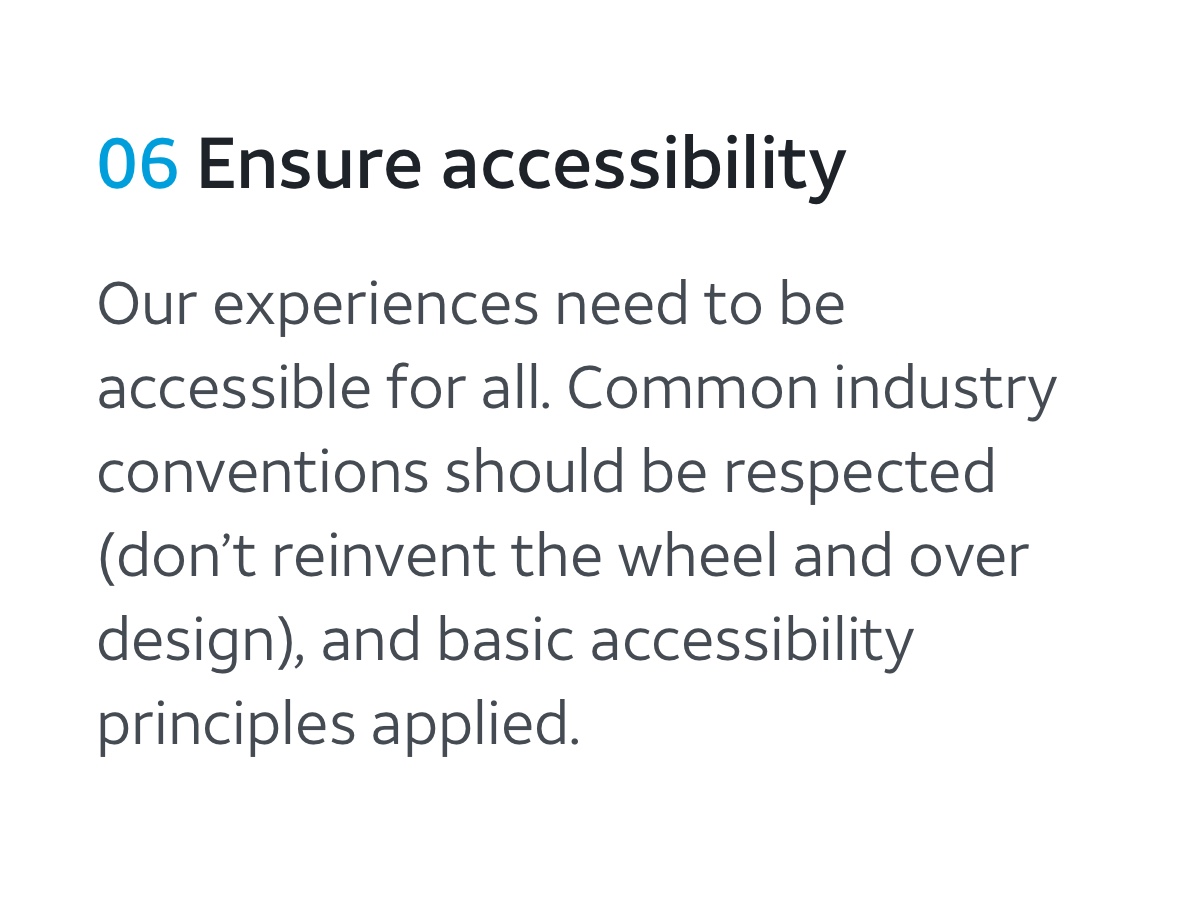
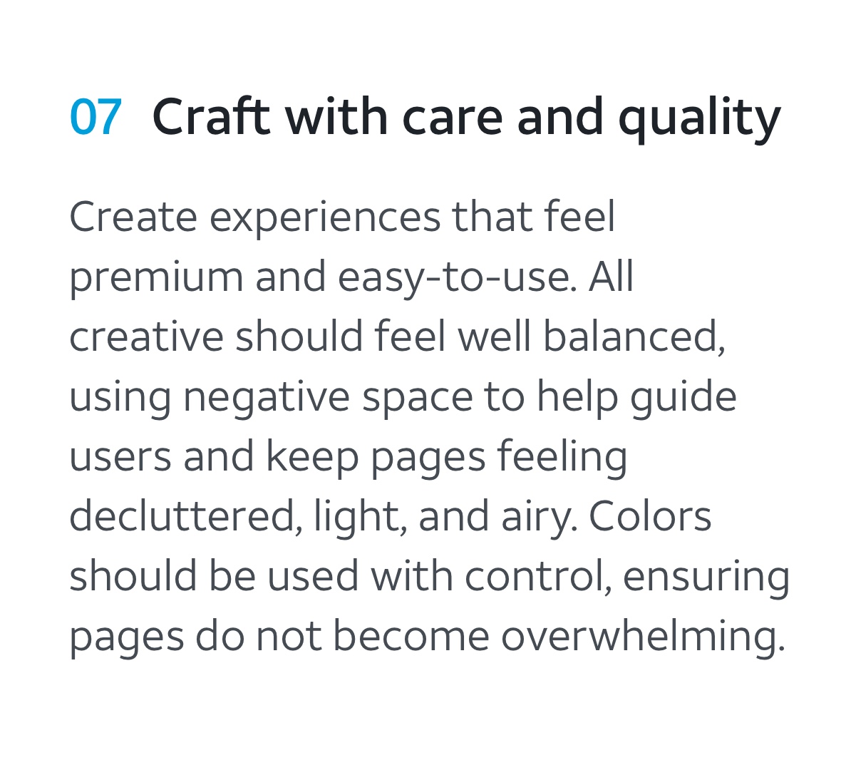
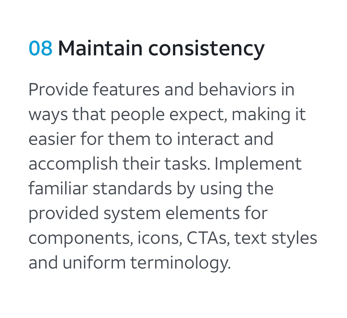
Principles
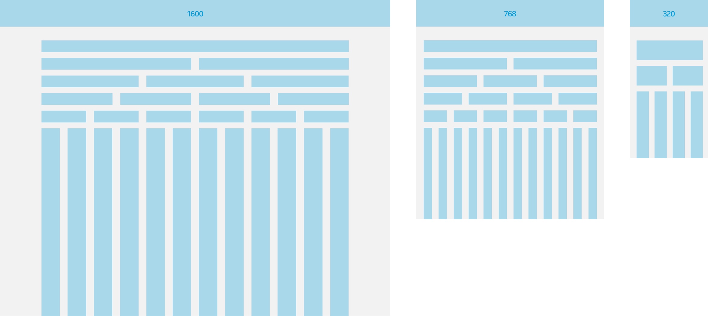
Grid
The underlying grid structure dictates the sizing and responsiveness of all components and layouts. Major breakpoints were reduced to three.
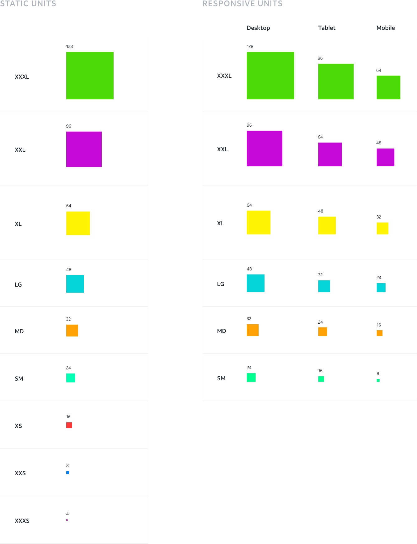
Spacing
Spacing within and between elements is driven by a system of standardized 8 point increments, which increases consistency, and makes it easier for designers and developers to communicate, while still allowing for a great amount of flexibility.
Typography
The typography system dictates the sizes, weights, and styles available for designers and developers to use.
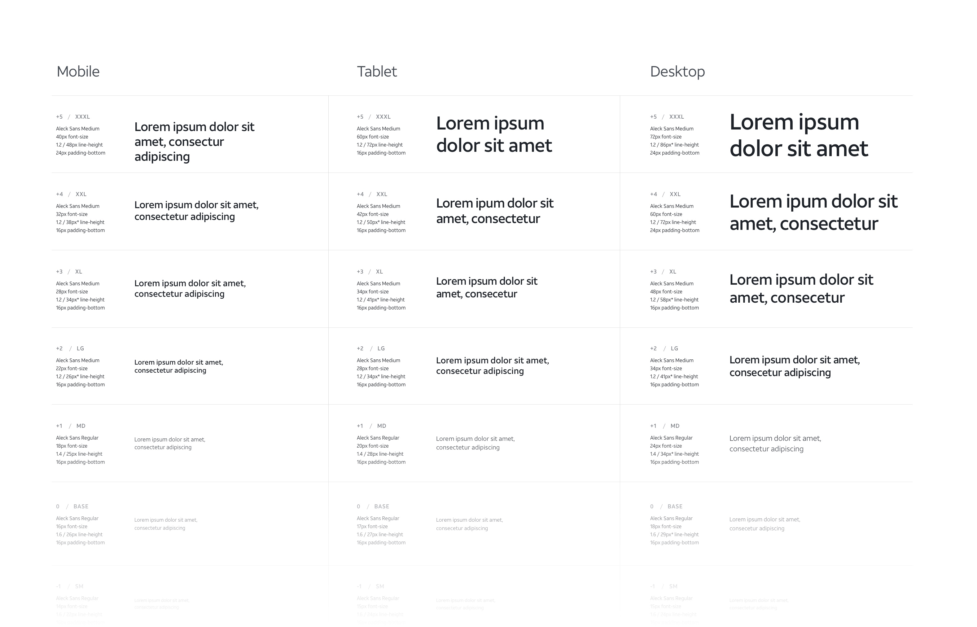
Modular Type Scale
The system uses a responsive, modular type scale, which helps to maintain proper type hierarchy across a wide range of devices.
UI elements
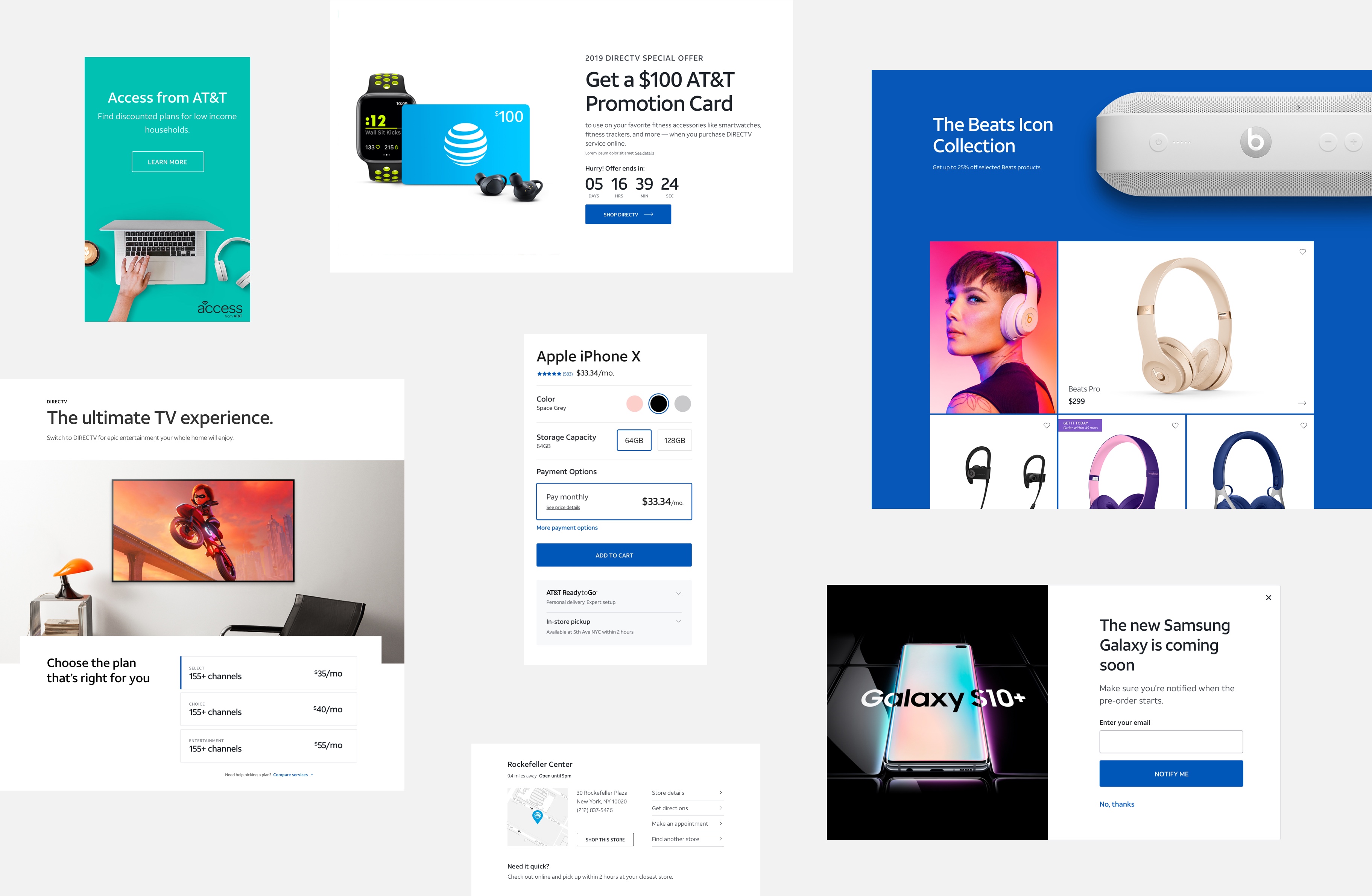
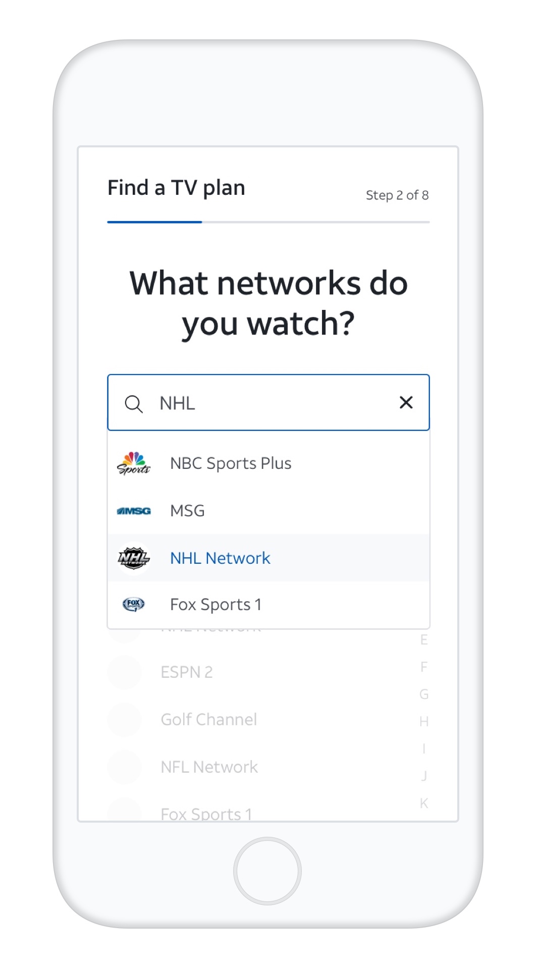
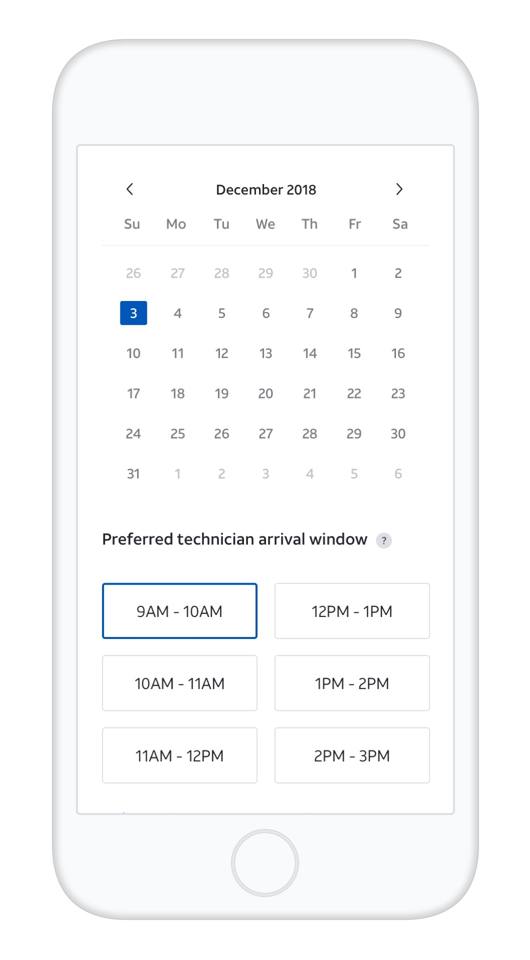
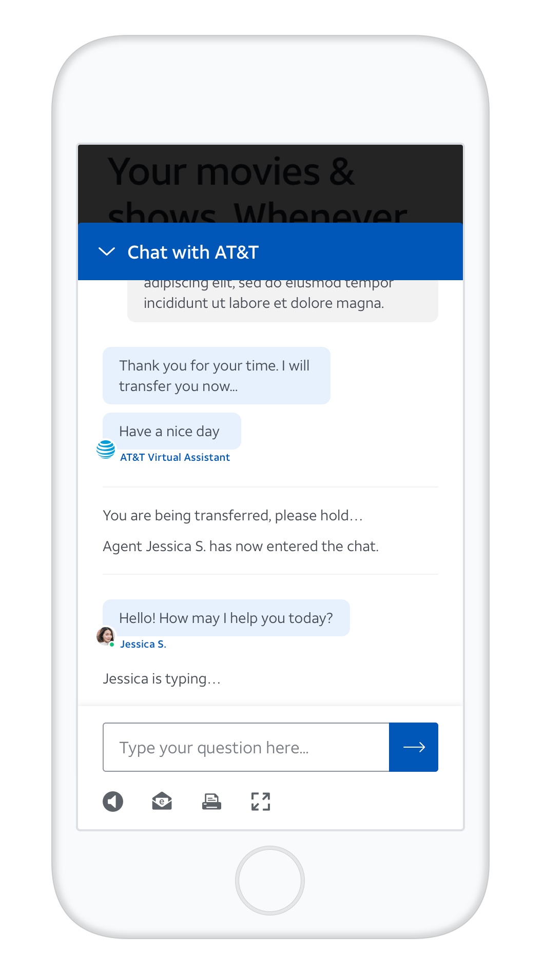
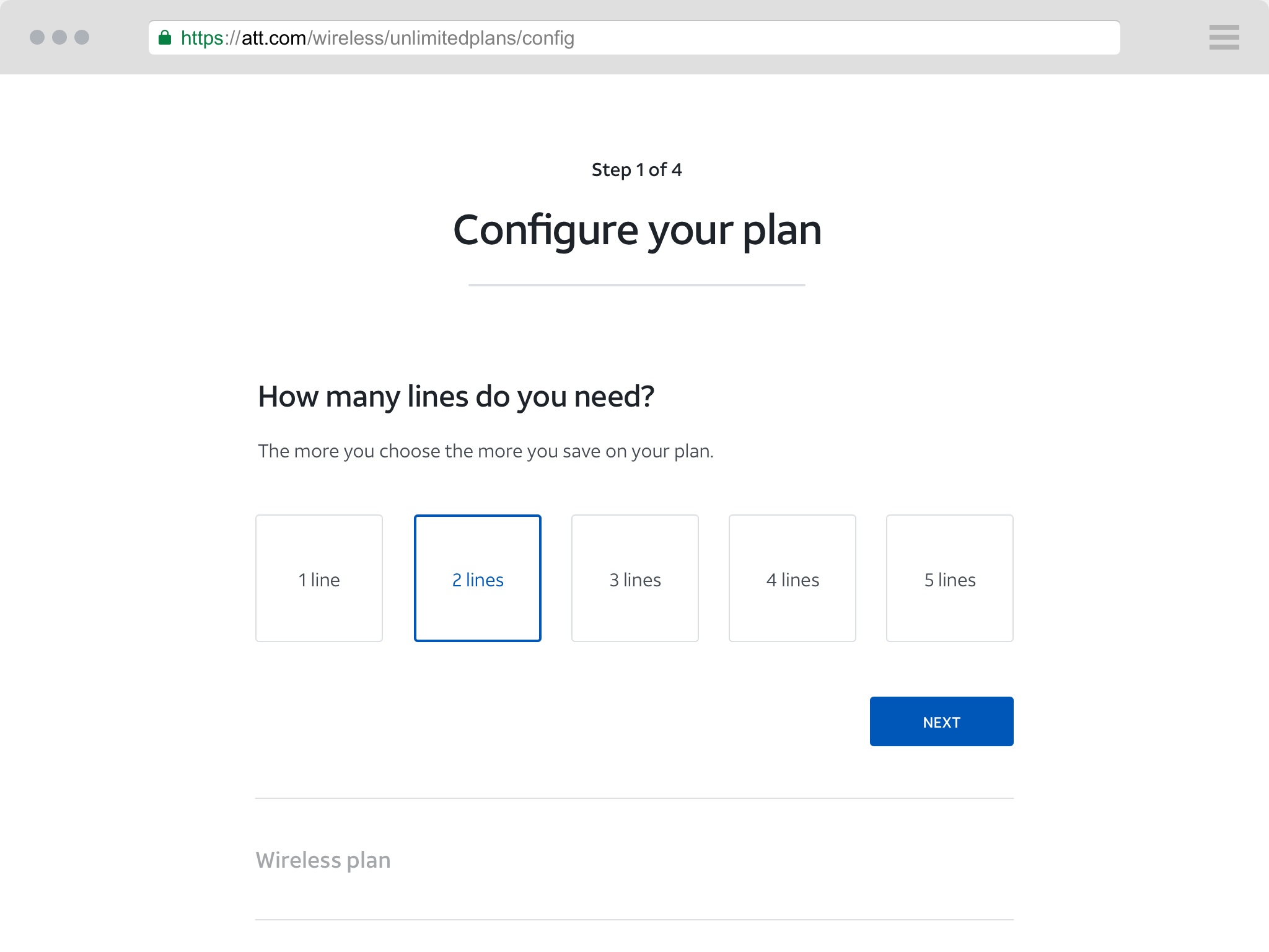
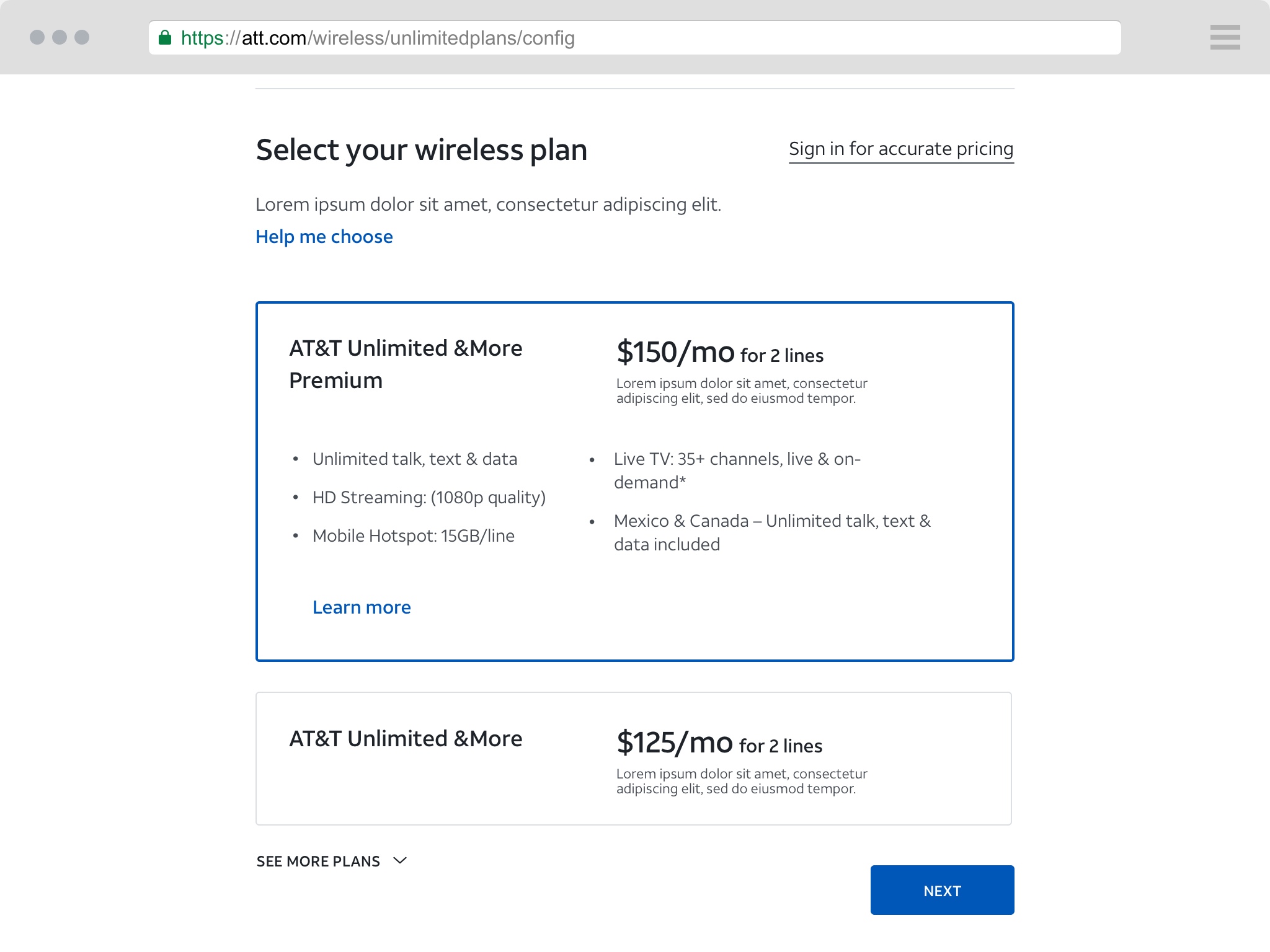
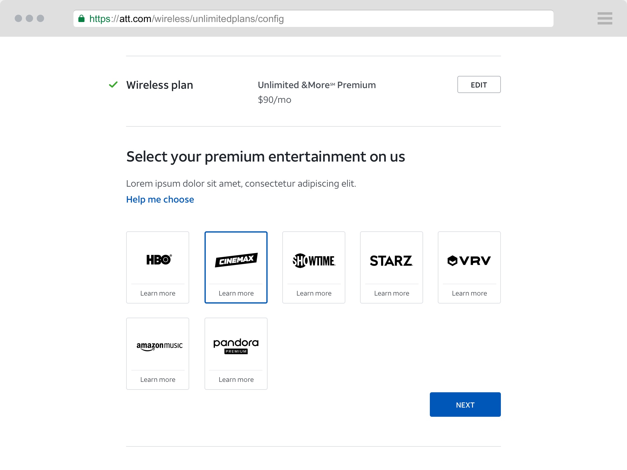
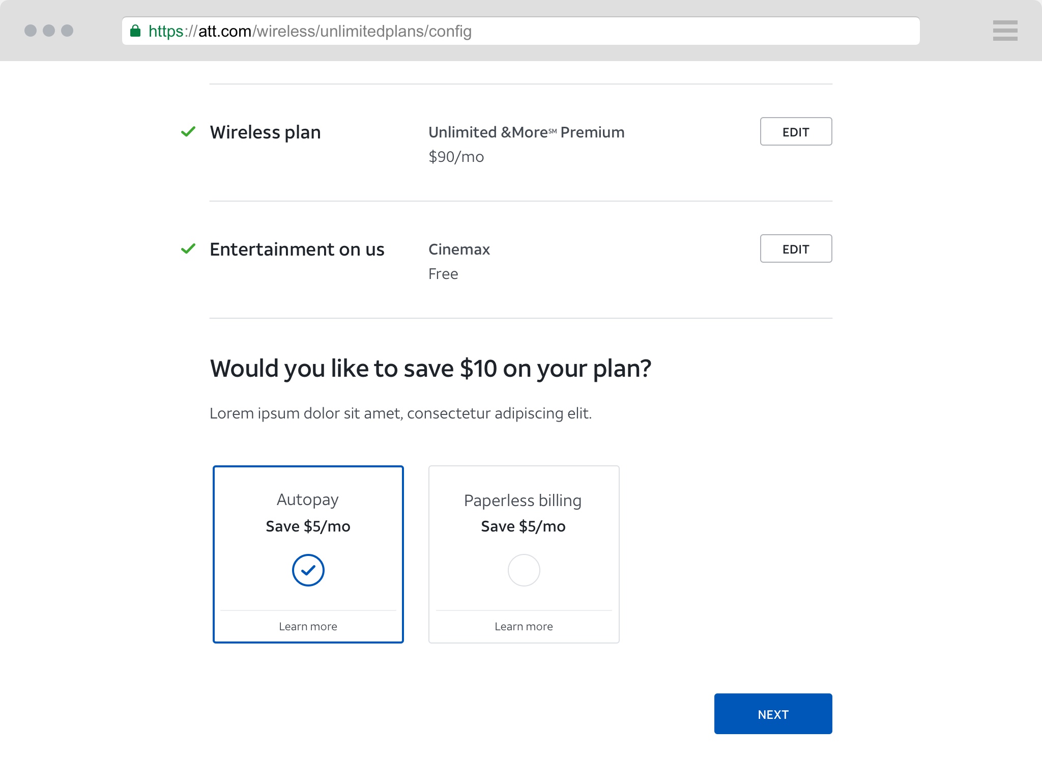
A set of foundational UI elements serve as the building blocks of the design system. Each element solves a specific user need, and has been designed to work together as part of the larger system. We partnered closely with the Design Technology team to align similar efforts and ensure consistency across in-flight work.
A set of foundational UI elements serve as the building blocks of the design system. Each element solves a specific user need, and has been designed to work together as part of the larger system. We partnered closely with the Design Technology team to align similar efforts and ensure consistency across in-flight work.
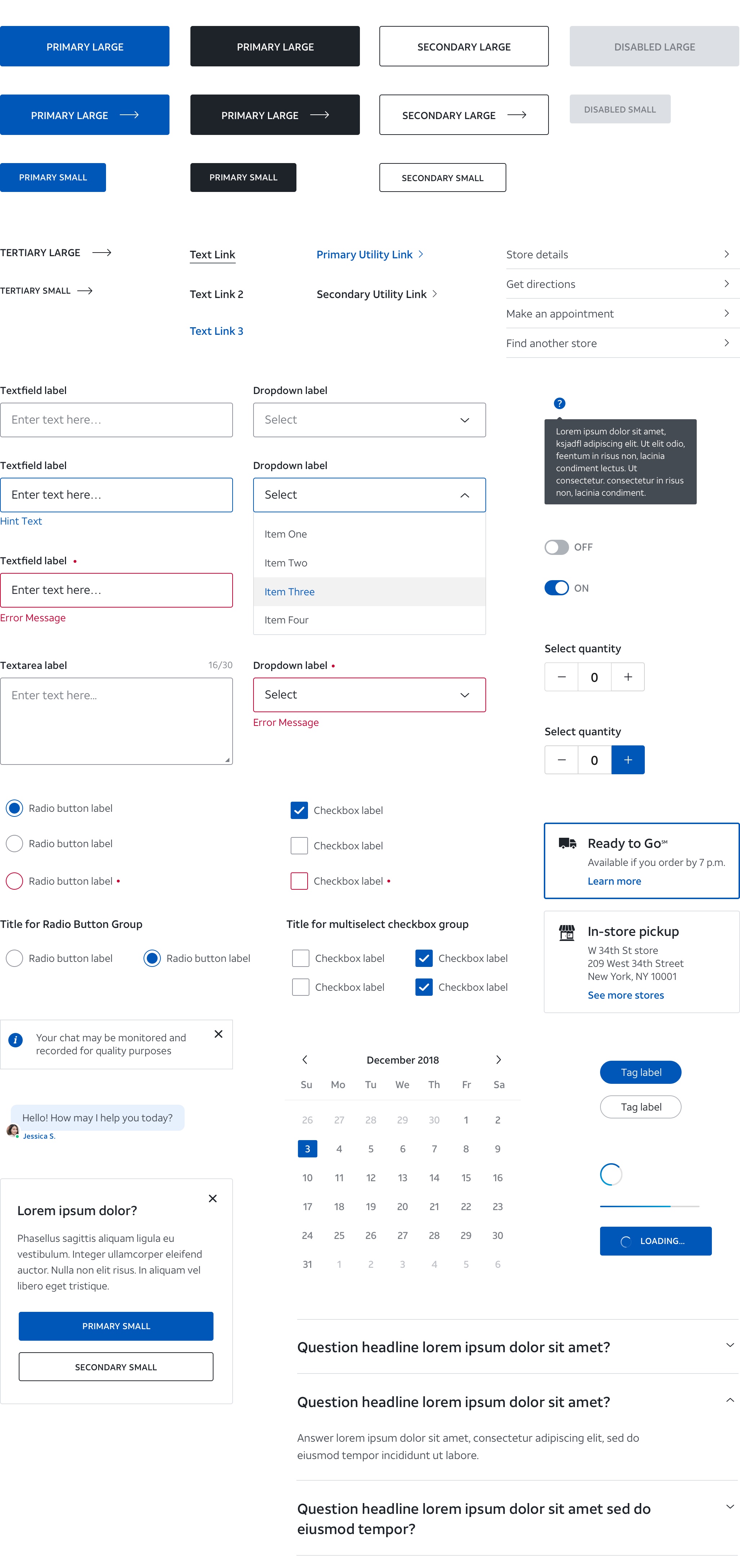
Example UI
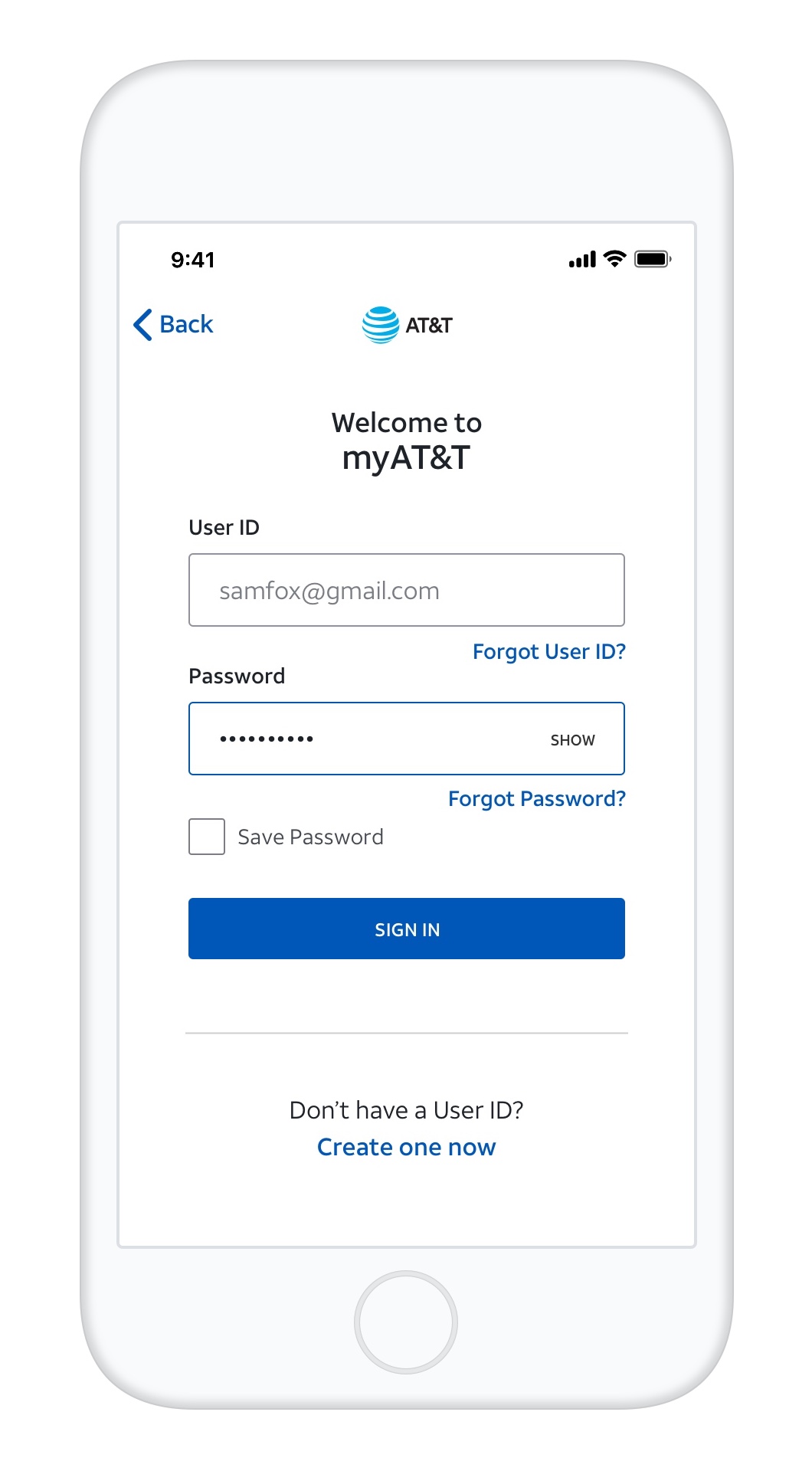
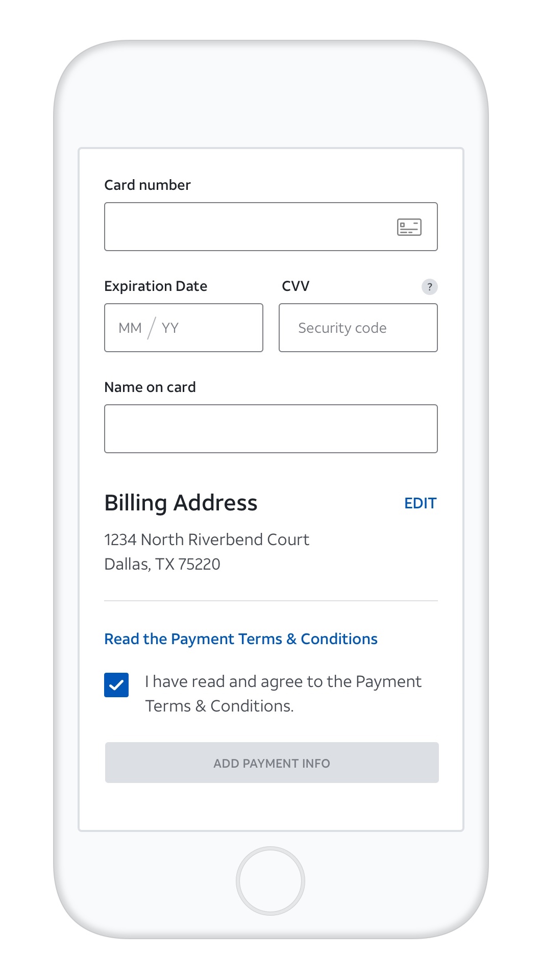
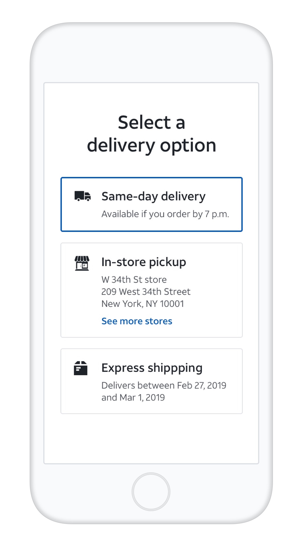
ATT.com reimagined
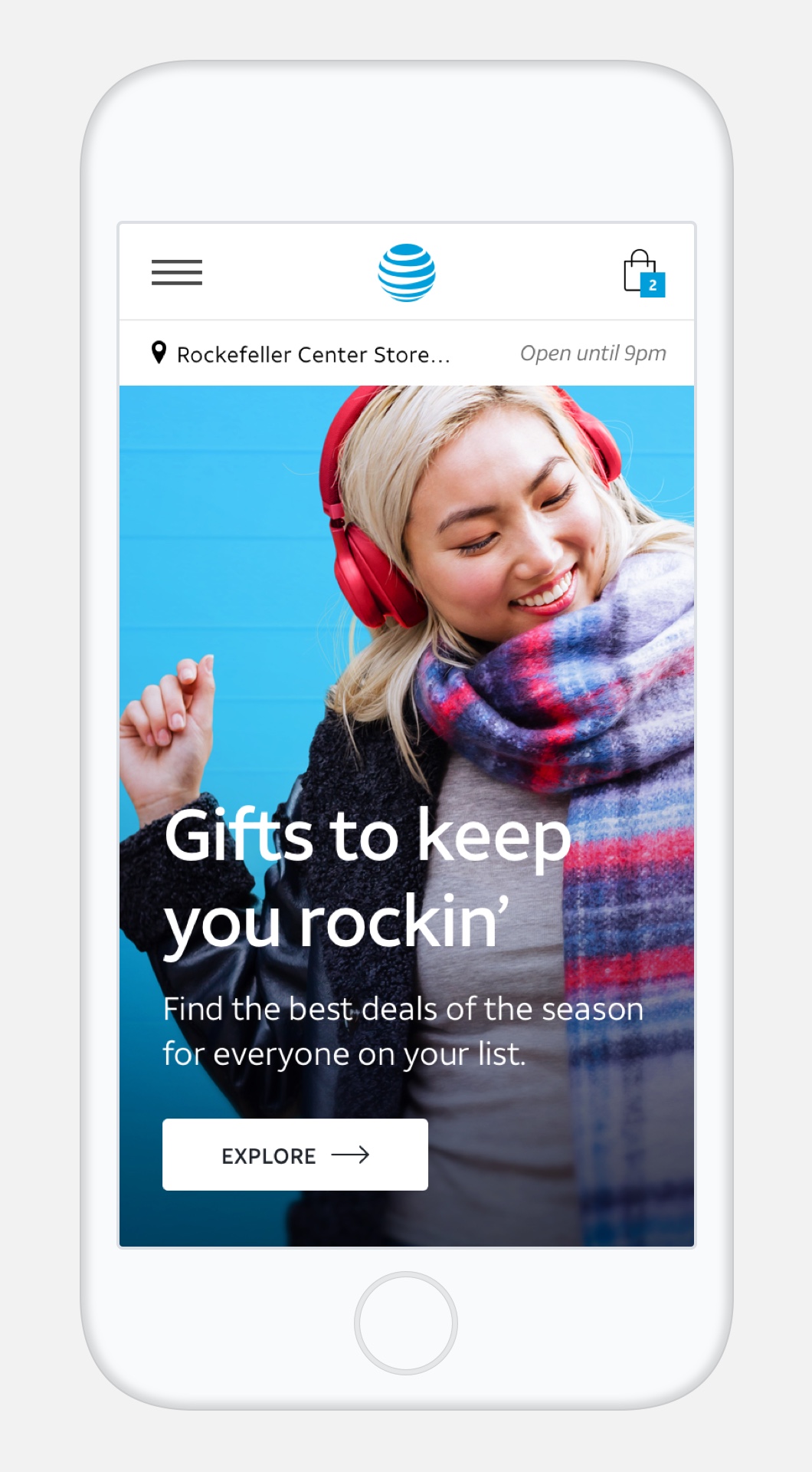
As one of the main windows into AT&T’s brand, products, and services, att.com was in need of an overhaul. With a goal of delivering a truly omni-channel and improved customer experience thats seamless and personalized, we got our hands dirty working cross-functionally to rethink the site from the ground up and strategize a path forward.
Sitemap & Navigation
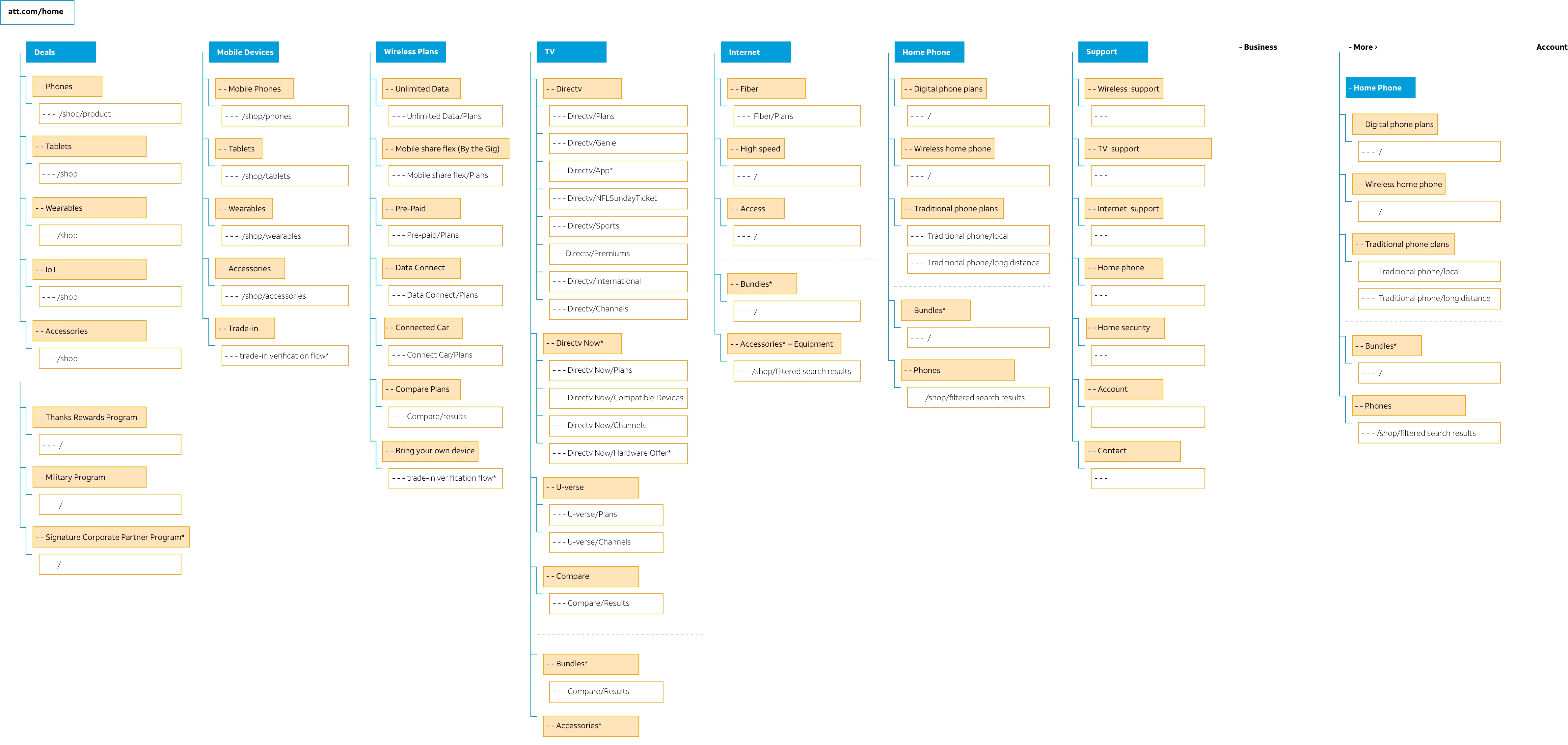
Complex and not fully integrated, the current navigation was taxing the cognitive load, providing customers with too many decisions, and a utilizing a layout that wasn’t platform optimized. Our team brought key players together to evaluate and rethink site and taxonomy, with the goal of clearly defining page types and purpose, better categorizing our products and services, developing a holistic end-to-end navigation strategy, and ensuring the UI design matched the quality and elevated aesthetic of the brand.
Complex and not fully integrated, the current navigation was taxing the cognitive load, providing customers with too many decisions, and a utilizing a layout that wasn’t platform optimized. Our team brought key players together to evaluate and rethink site and taxonomy, with the goal of clearly defining page types and purpose, better categorizing our products and services, developing a holistic end-to-end navigation strategy, and ensuring the UI design matched the quality and elevated aesthetic of the brand.
UX Framework & User Flows
UX Framework & User Flows
UX Framework & User Flows
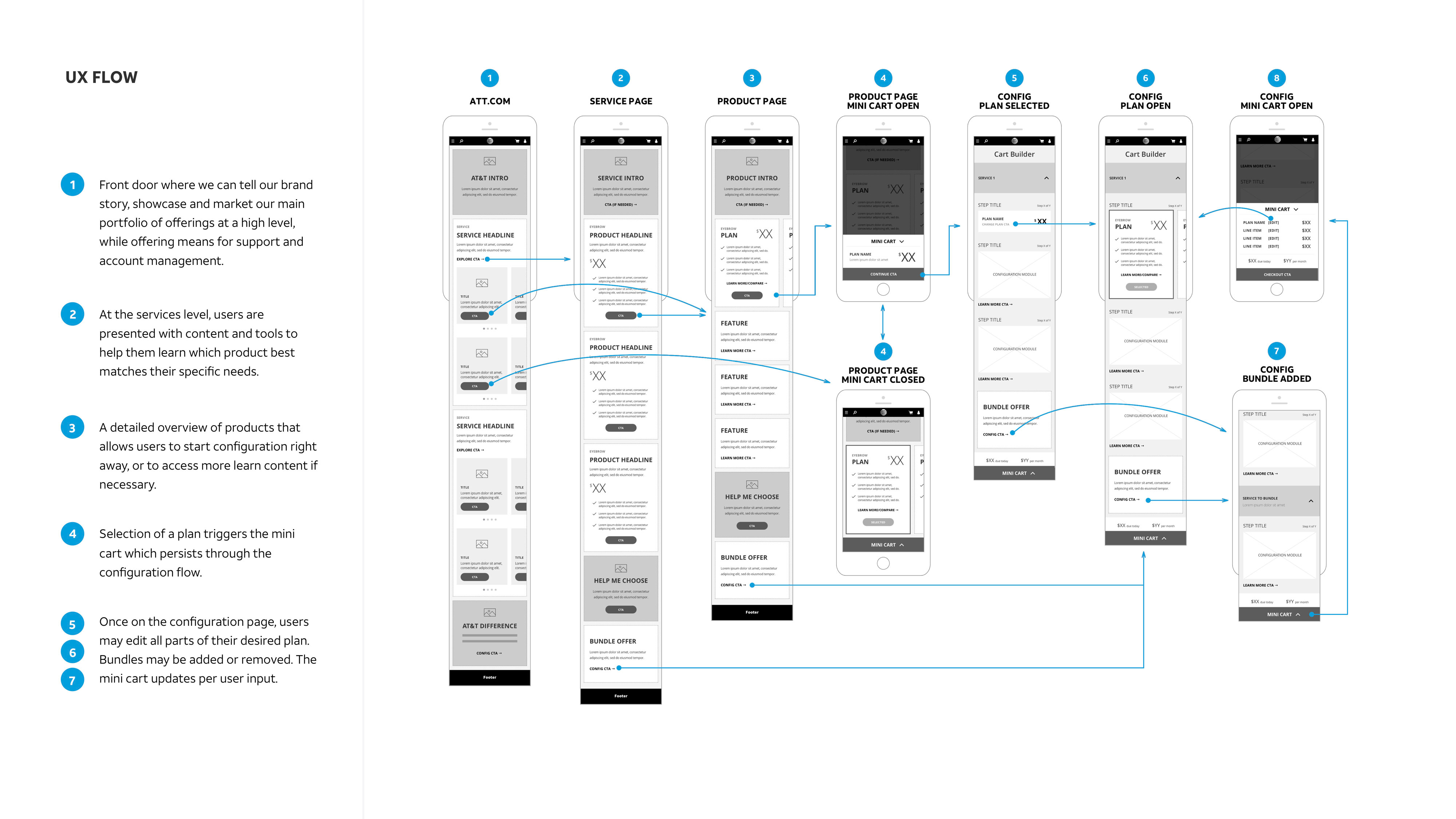
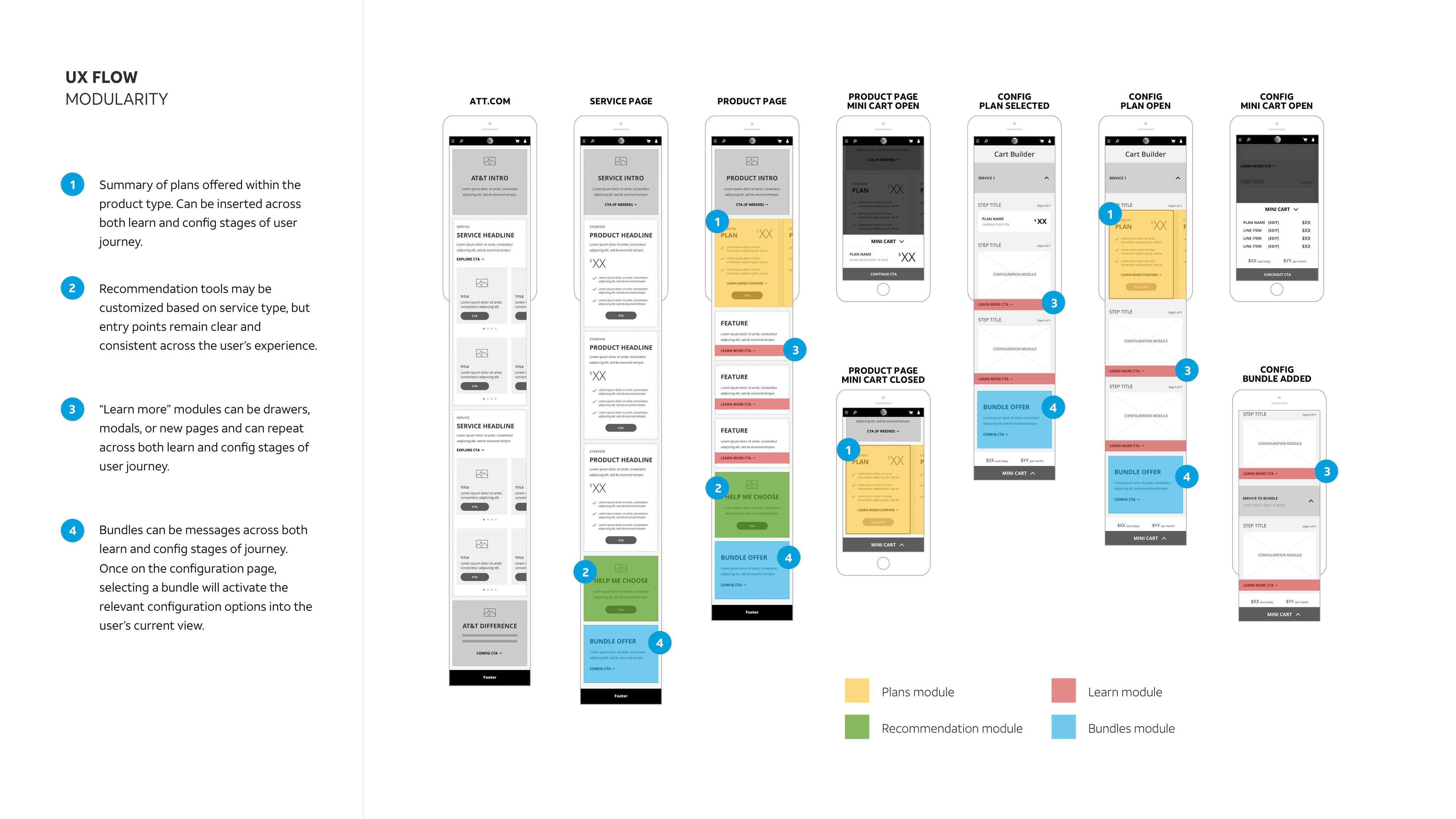
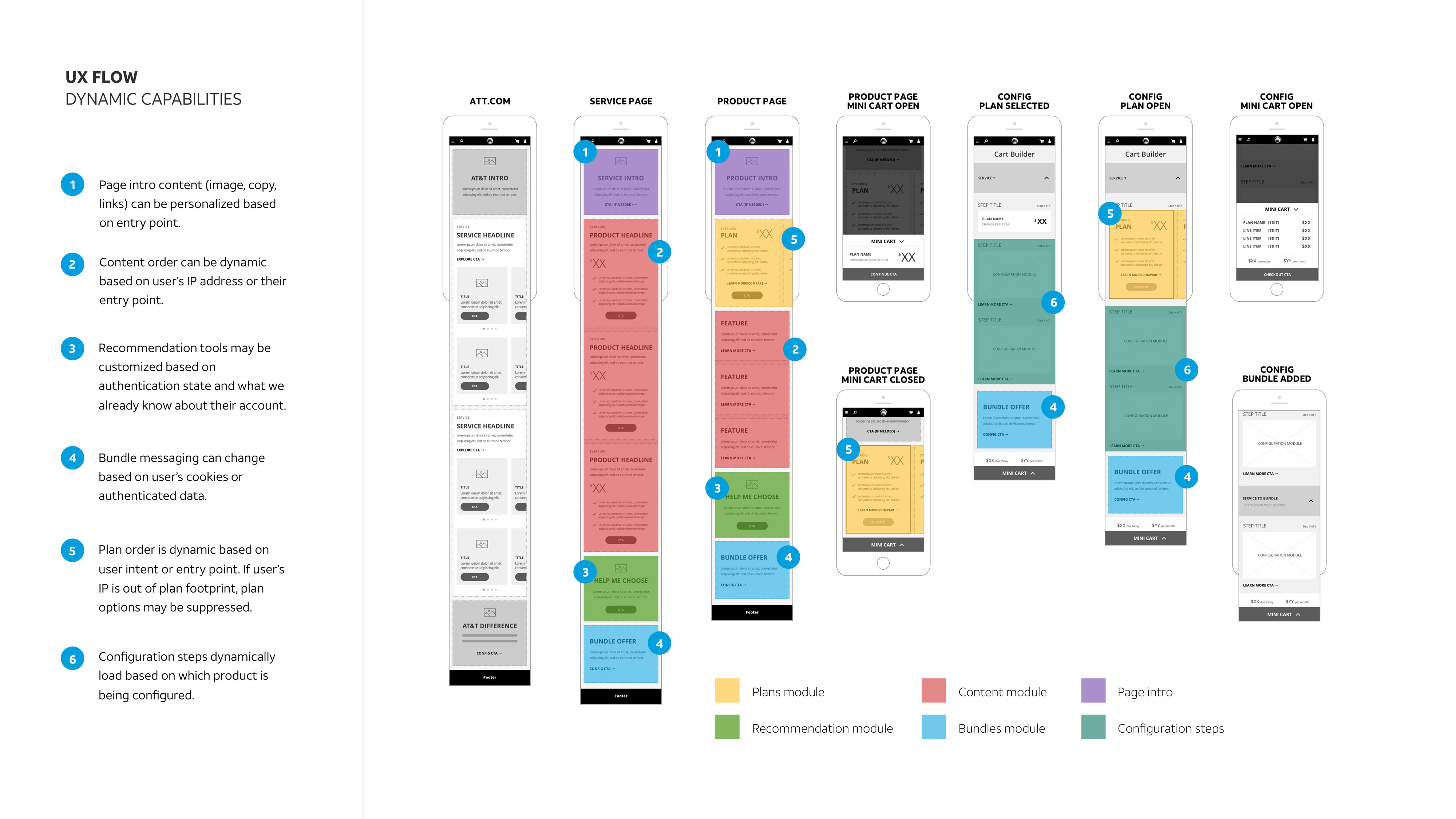
Collaborating closely with our UX team, we strategized end-to-end flows and an improved framework that took into account the need for a modular, personalized, and seamless experience—allowing customers to shop when and how they want. We conducted in-depth research to gain insight into the problems users are facing, and met with several design teams to understand the products they were creating, and how we can bridge paths and create an experience that’s unified from upper to lower funnel, all the way through checkout and beyond.
Homepage Components
Homepage Components
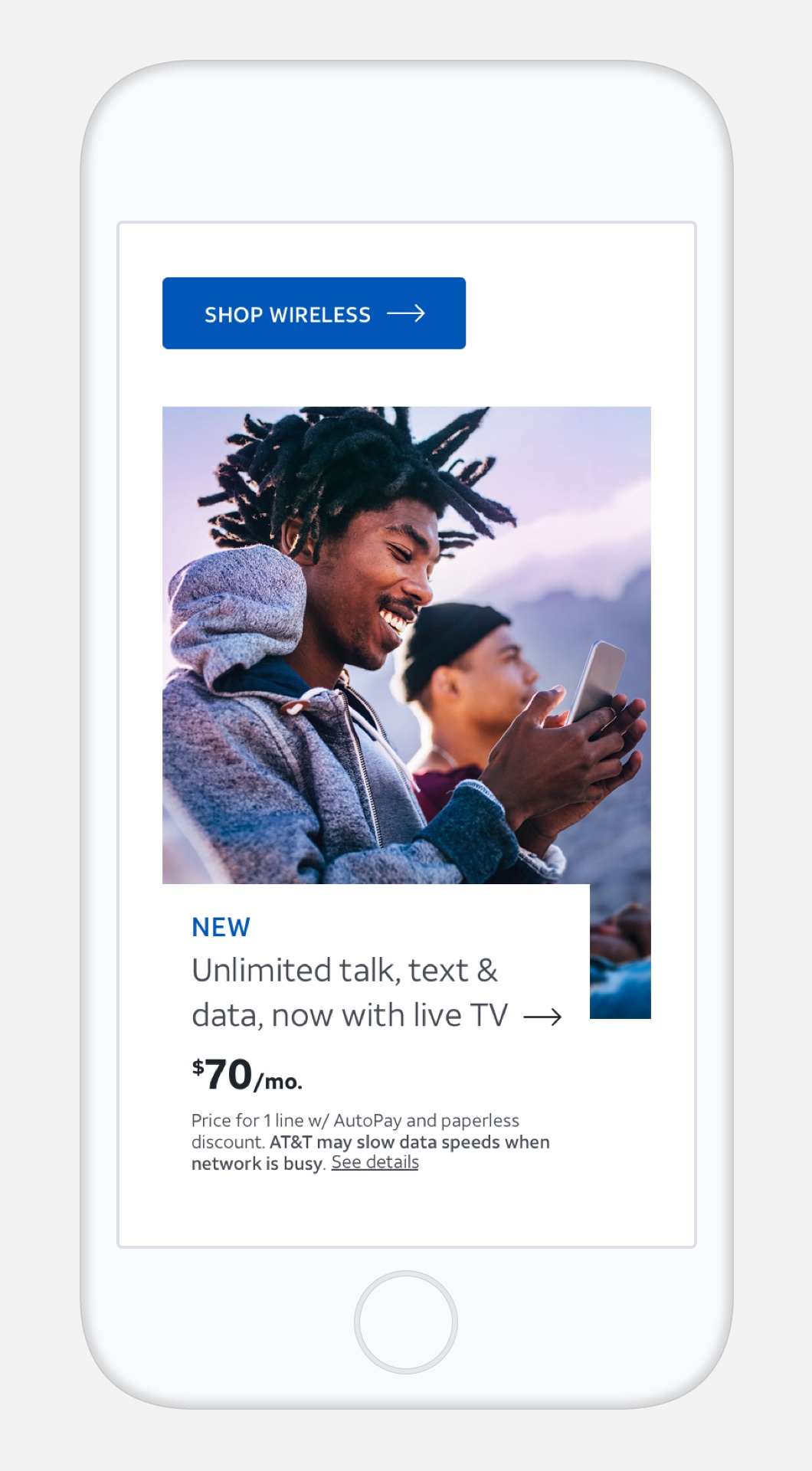
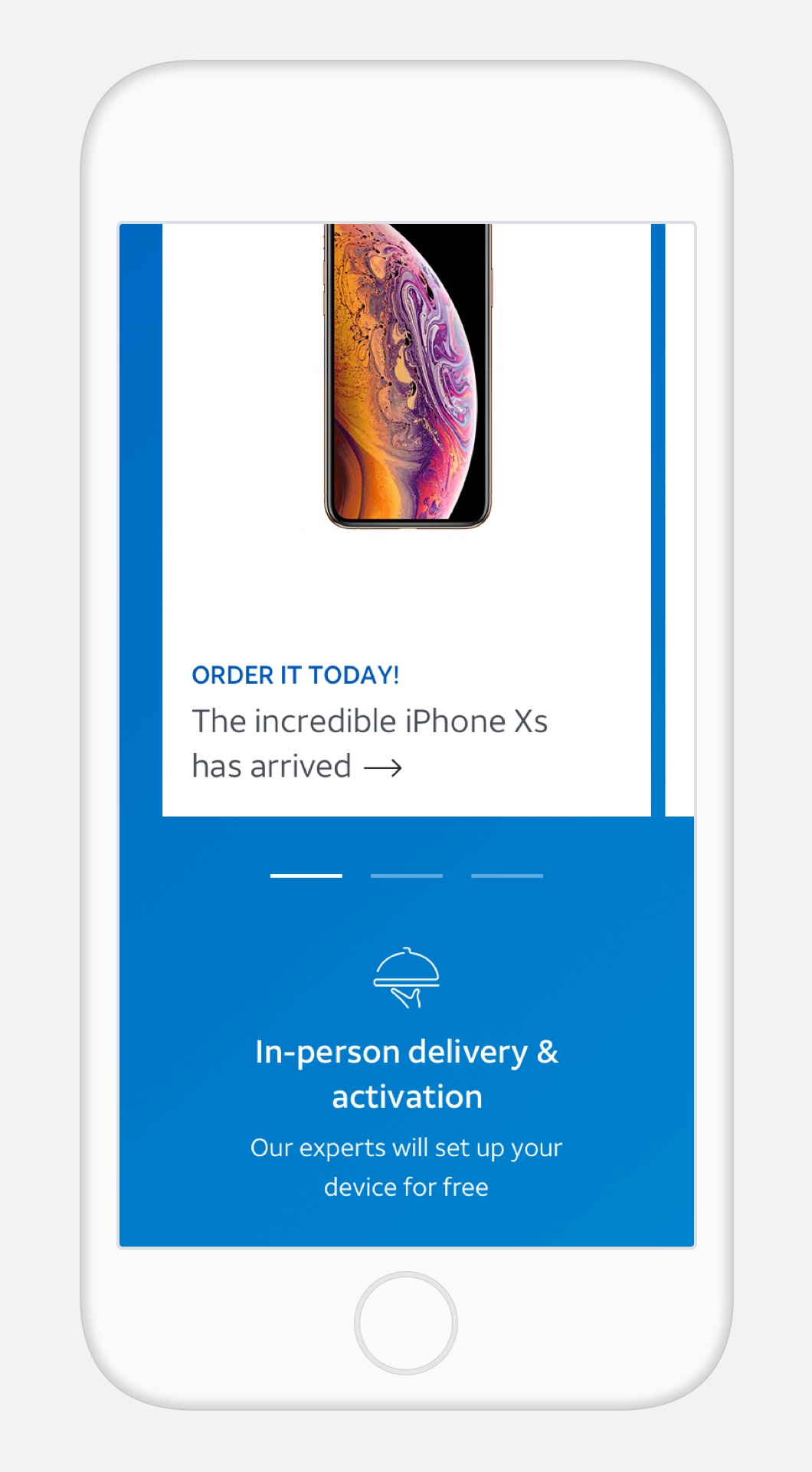
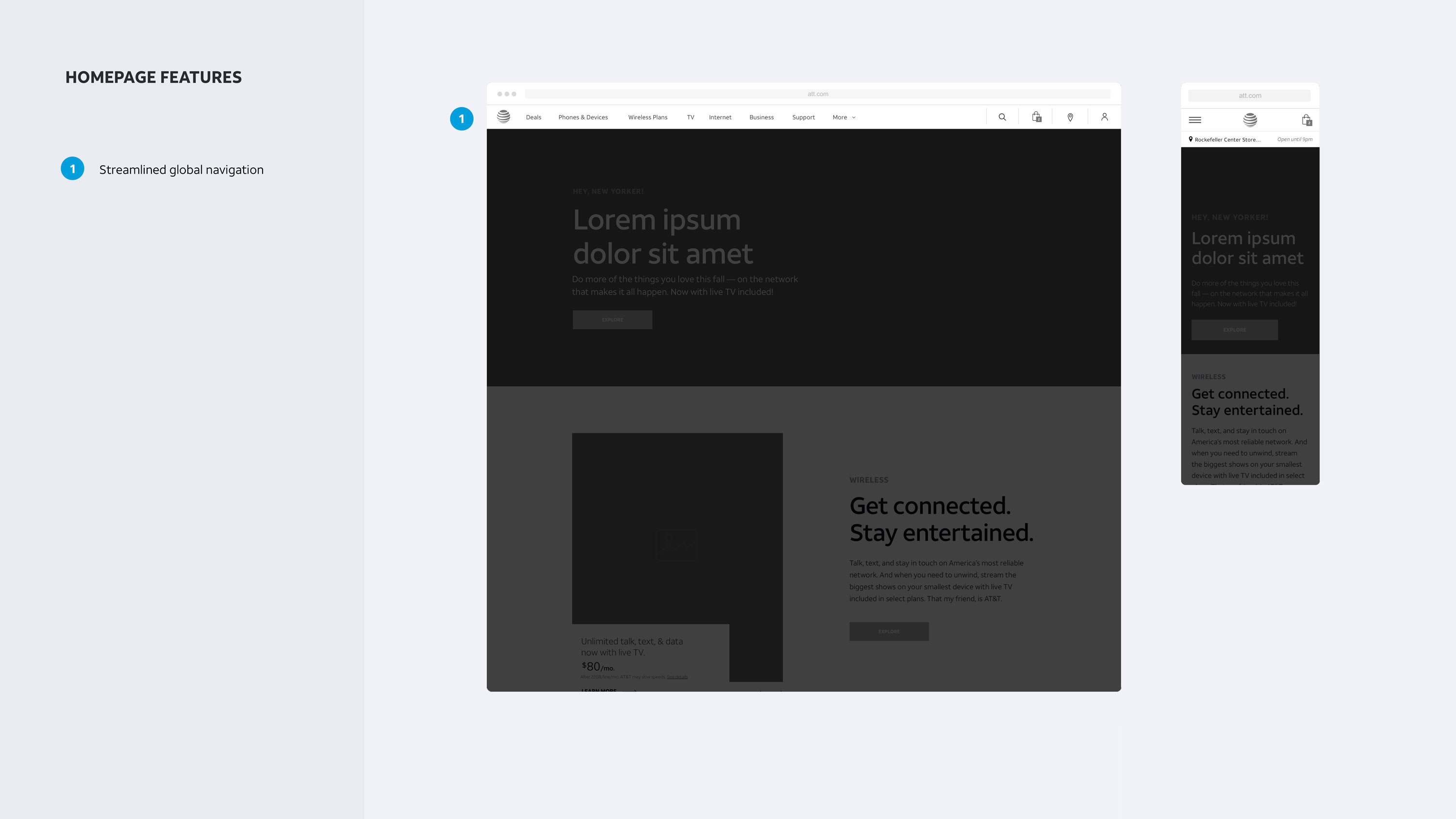
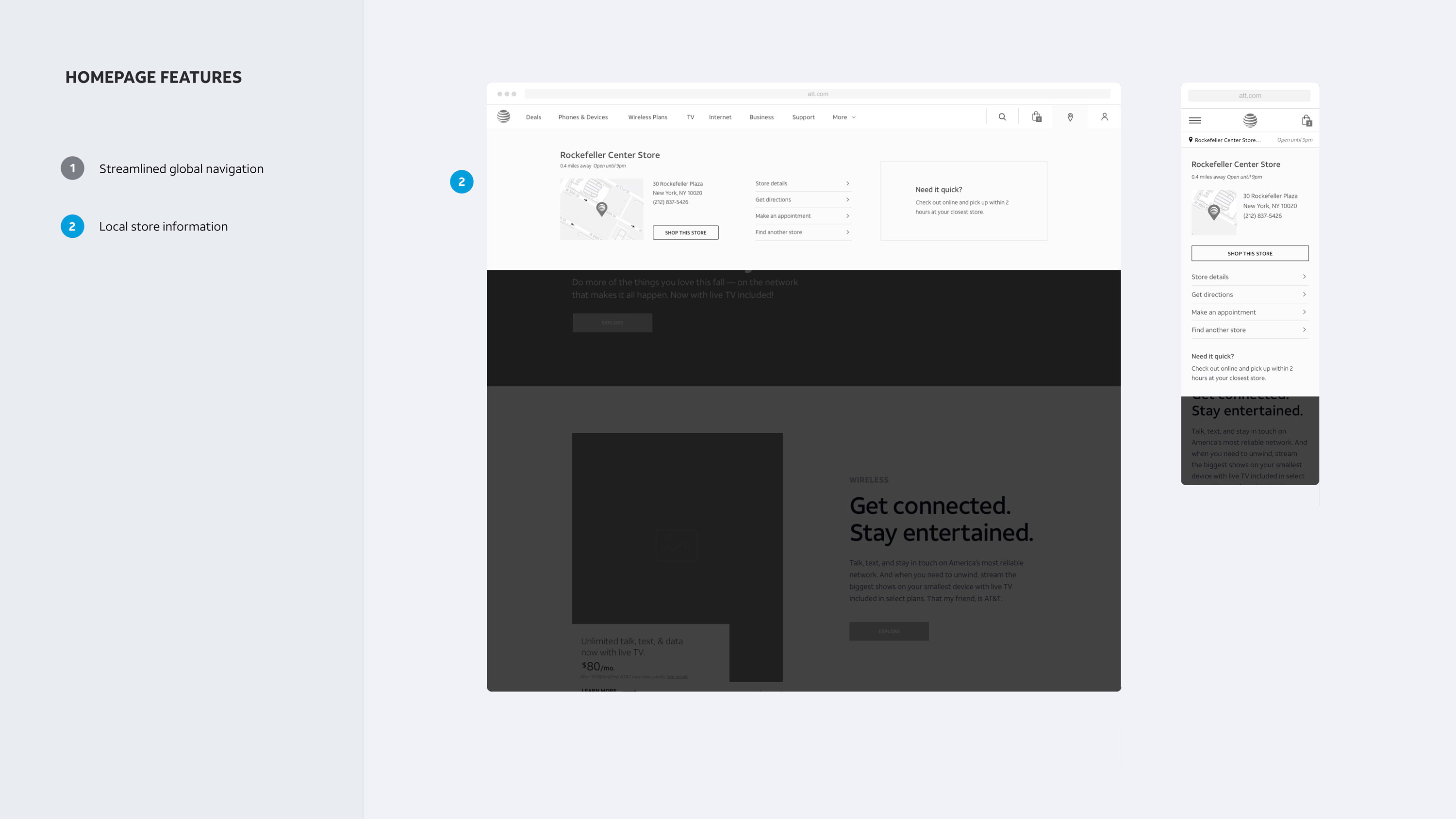
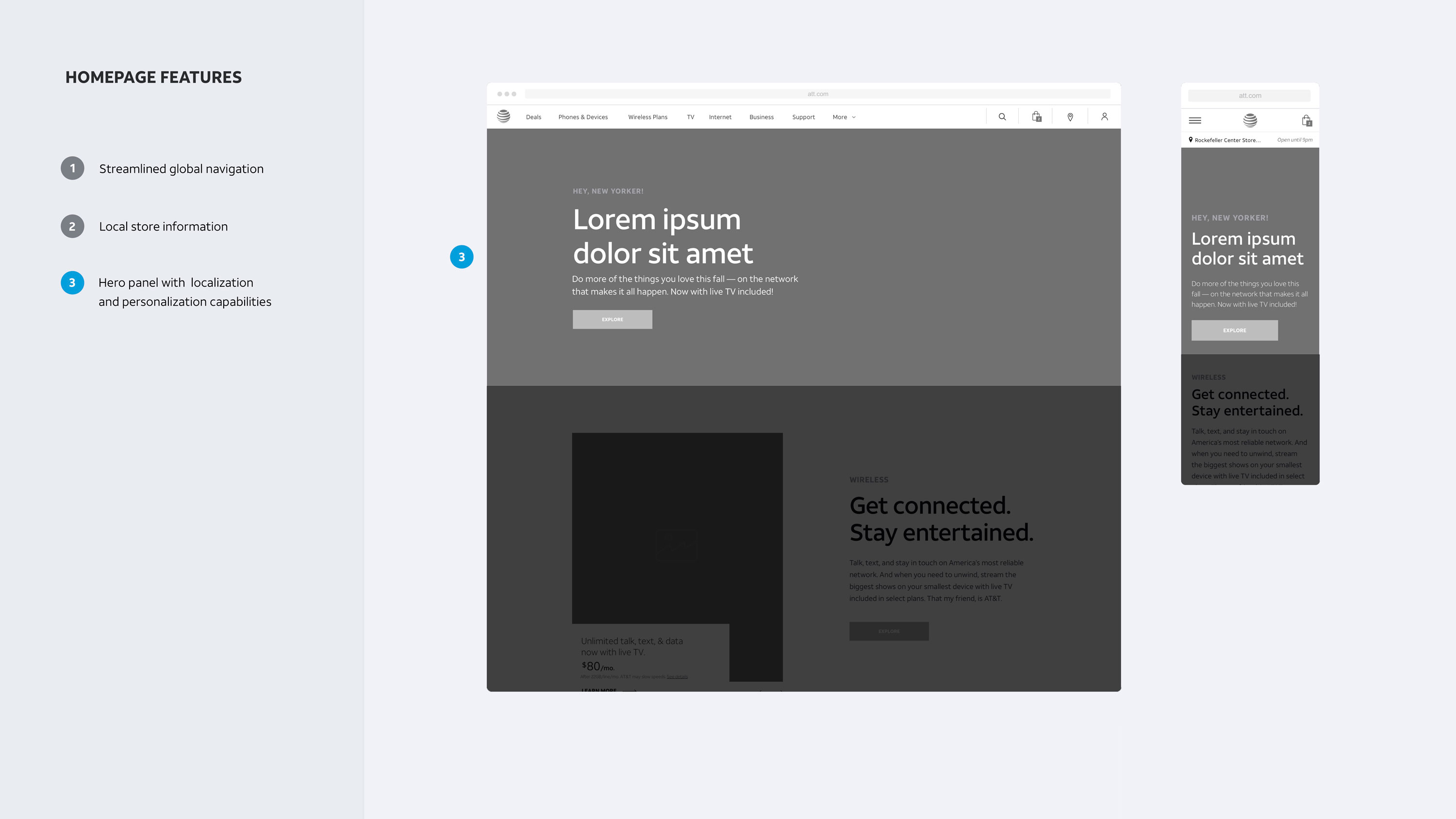
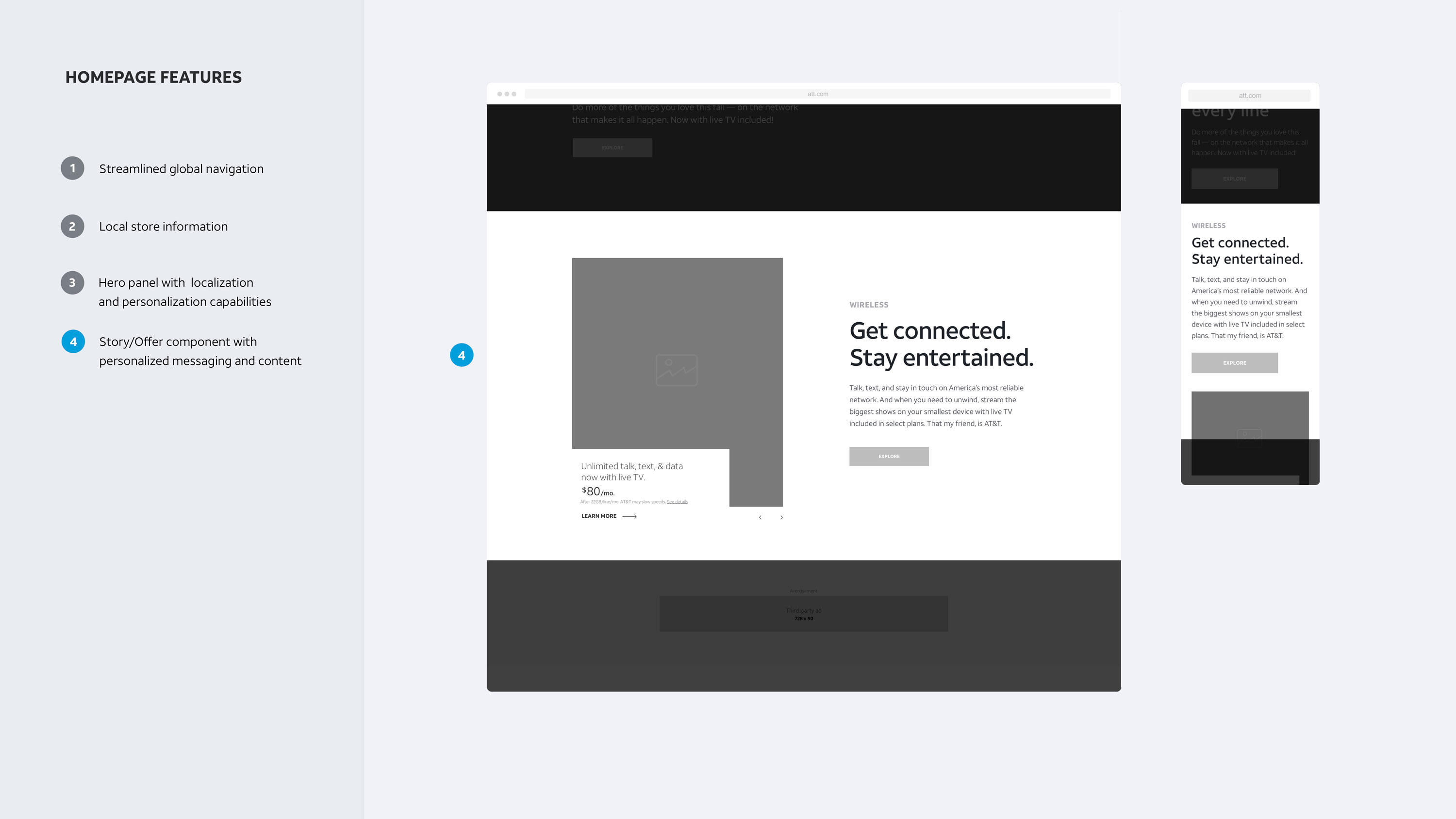
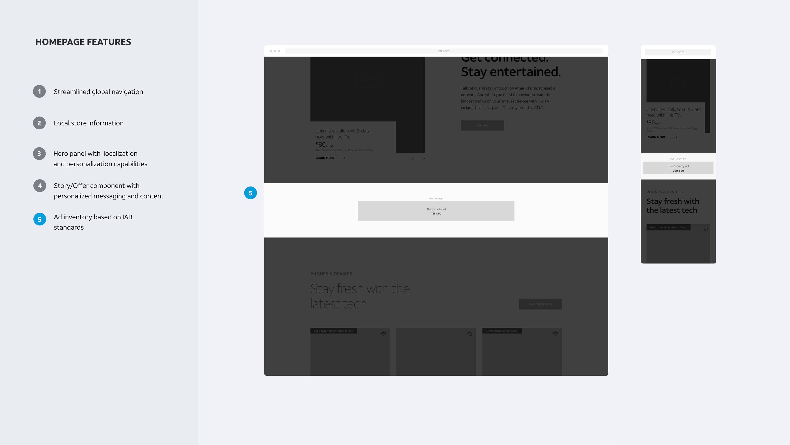
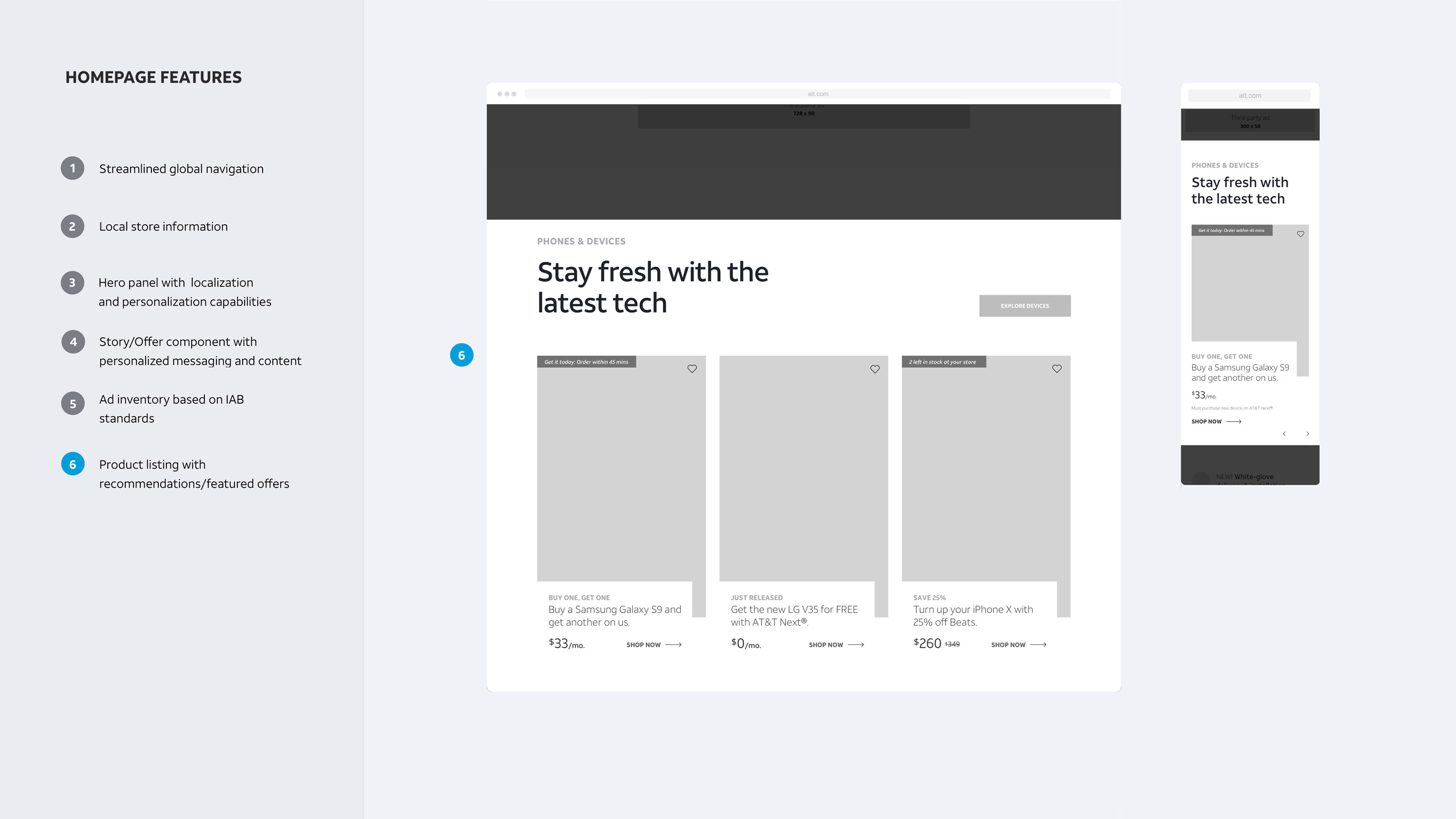
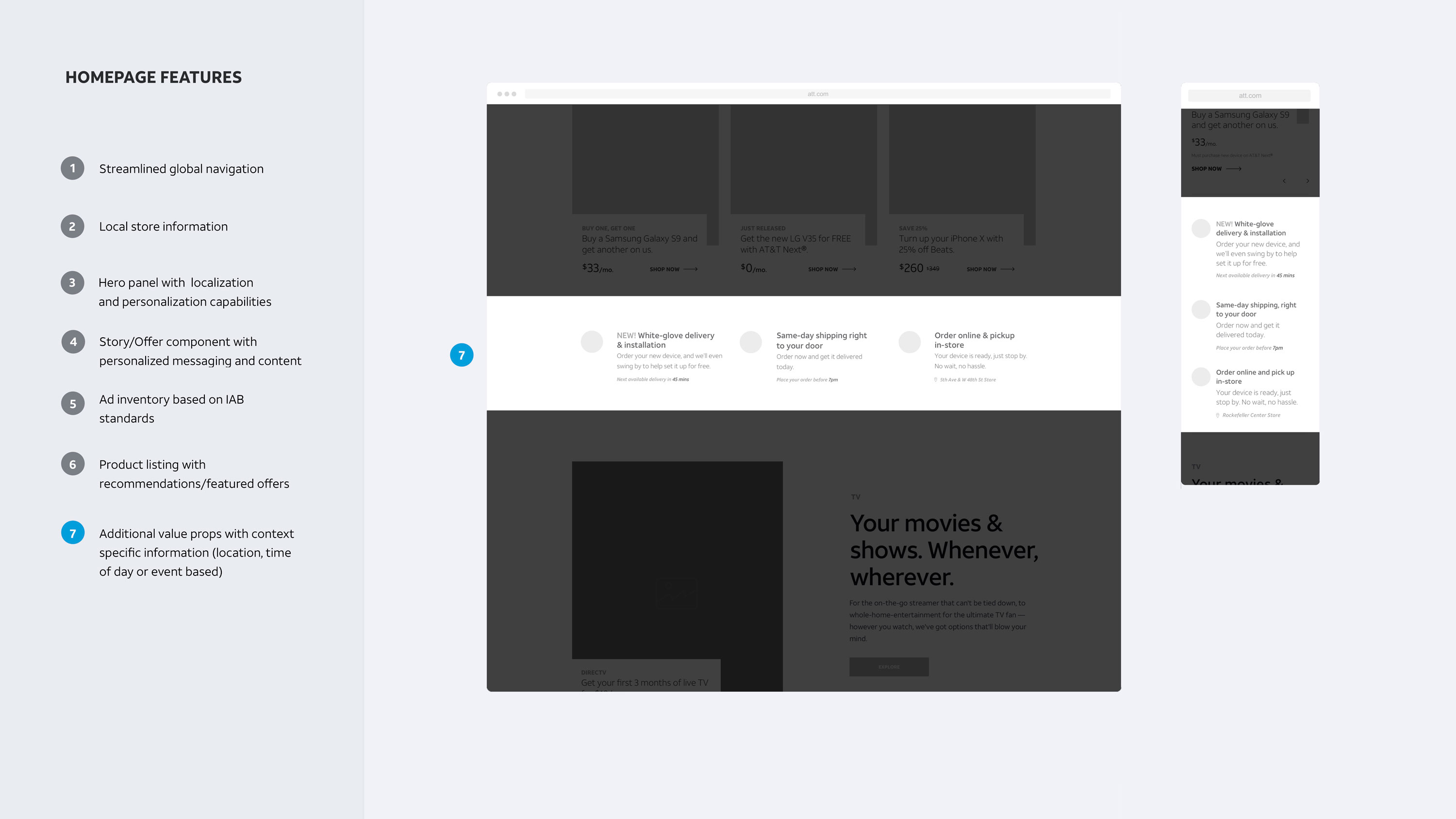
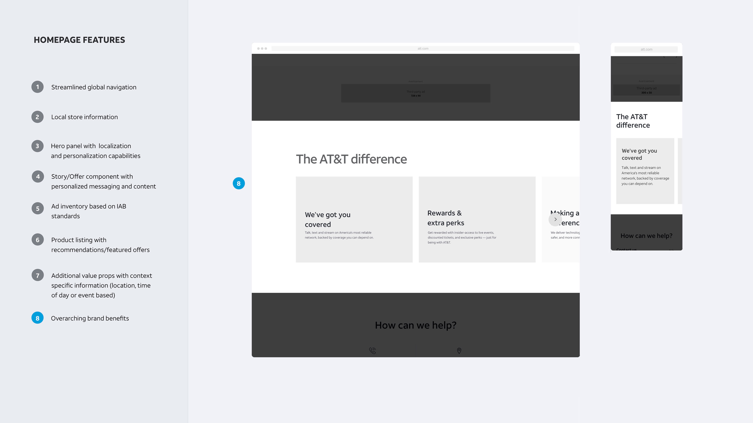
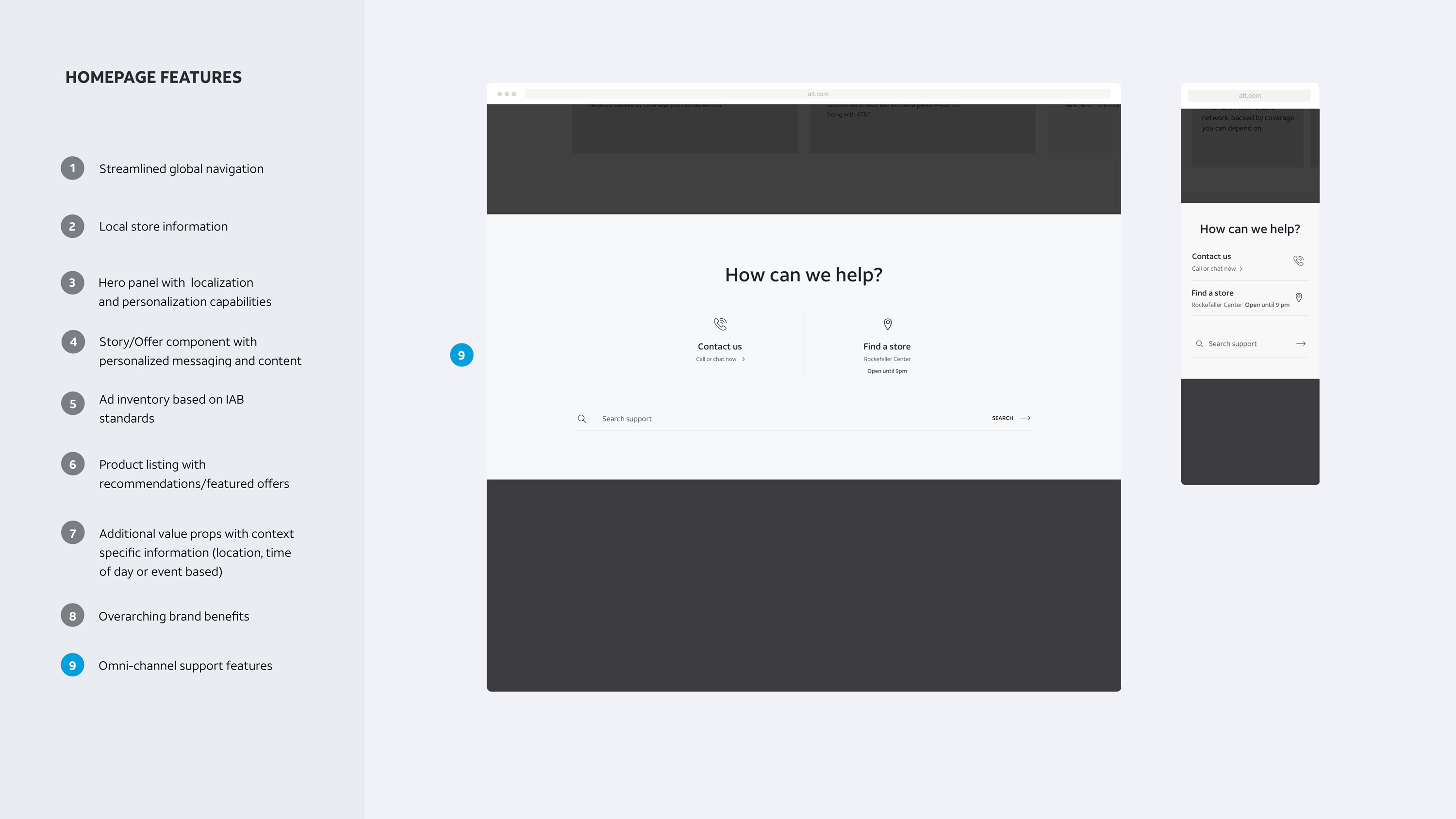
We designed a set of components each with a specific purpose and clear guidelines. These were to be the foundation of components moving forward, with the overall goal of reducing the amount of components site wide.
Digital Creative

